
Segment Overview Dashboard
The Segment Overview dashboard helps you understand your audience based on consumption or behavioral patterns that identify which segments have the highest reach (size of audience) as well as emerging segment trends. This dashboard contains a visual and tabular data display of content consumer groups and interrelationships.
The graph displays the top ten behavioral segments by default. For a list of segment definitions, see Audience Segments.
To customize the data in the graph, do the following:
- To remove the pre-selected segments individually, click the X for that segment or click Clear All to remove all the segments at once.
- Search a segment by typing the name or category tags which you assigned to the segment or click the segment name in the list box to add or remove it.
- Click Apply.
How to interpret the graph?
The size of the segment circles indicates the overall reach of the segment and proportion of consumers during the selected period. This helps you understand the viewership distribution across segments (circle size) and the behavior characteristics of the most dominant segments.
- Hover over a segment to display the segment total.
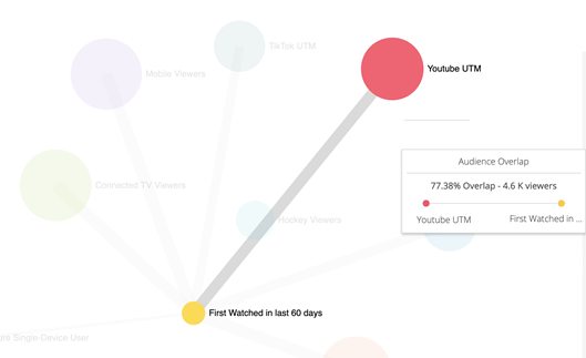
- Hover over a line to display the percentage of overlap with the connected segments.
Note: In the screen shot below, when you hover from Youtube UTM to a segment, the percentage is the audience of Youtube UTM divided by the segment. This means that 77.38% viewers of Youtube UTM are also the first watch viewers in last 60 days. If you hover from the other circle, the percentage changes accordingly.
The table is a ranking list to track the performance of all segments in your account.
-->Click the name of the segment to display the Overview dashboard for that segment.
Overview data for the segment metrics such as Top Content by Engagement and Plays, Segment KPIs, Segment Share of Viewers, Consumption by DMA, Content Plays by Device Type, and Plays by DayPart and Day of Week.
See the Overview Dashboard for more details about the displayed data.