Apply these advanced use cases to discover the value of Widgets in custom dashboards.
Map Chart Creation
Custom dashboards display metrics and dimensions in a map chart format within widgets. The map chart provides an intuitive method to view metrics from geographical perspectives, including country, state, and city.
Creating a Widget with a Map Chart
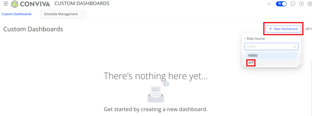
- On the Custom Dashboard main page, click Add New Dashboard in the top right corner, select APP from the Data Source list, and click Create.
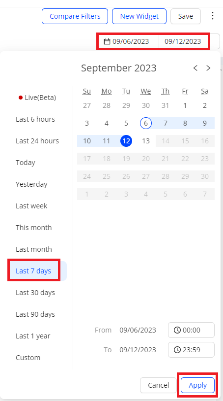
- From the date picker, select the time range, and click Apply. The default time range is Last 6 hours. In this use case, use Last 7 days.
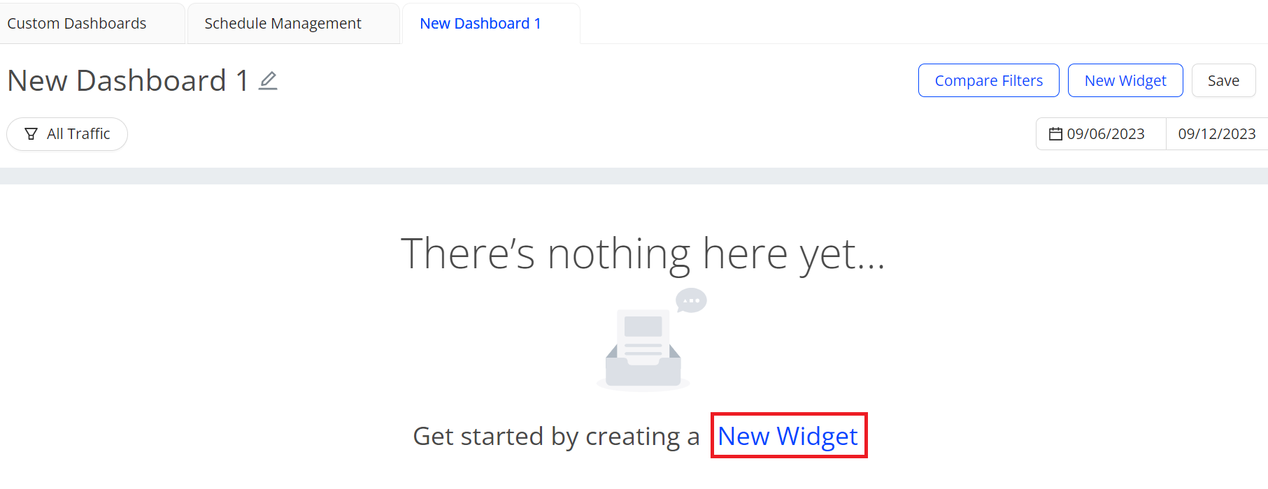
- To go to the Add New Widget page, click New Widget.
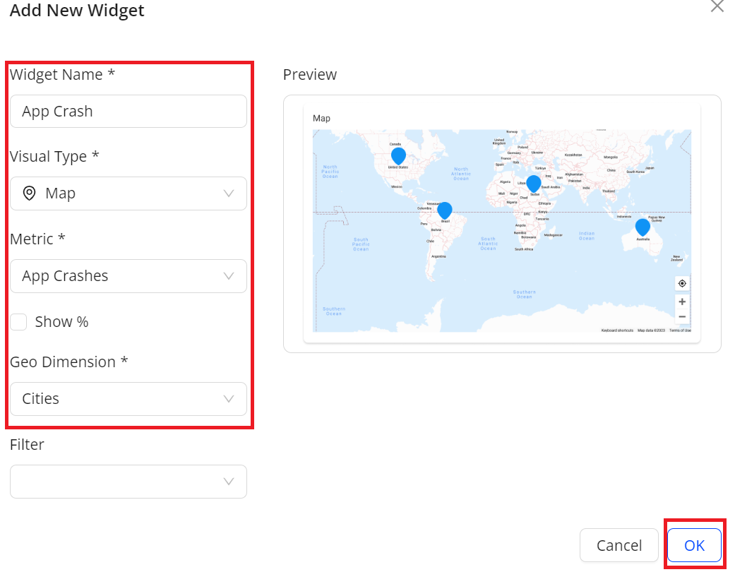
Fill out the Widget Name field, select the suitable items, and click OK. The map chart displays in the widget.
Widget Name: App Crash
Visual Map: Map
Metric: App Crashes
Geo Dimension: Cities
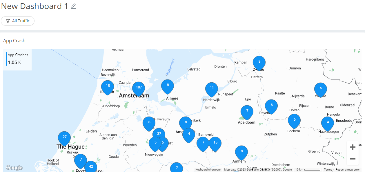
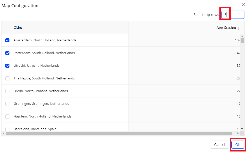
- To display the top three cities on the map, select the Map Configuration icon, enter 3, and click OK.
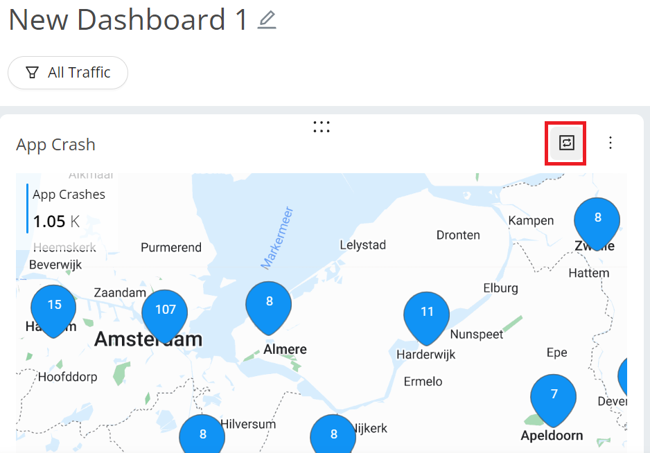
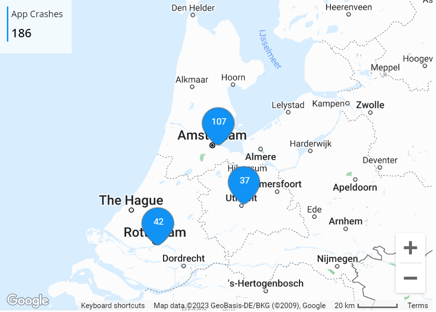
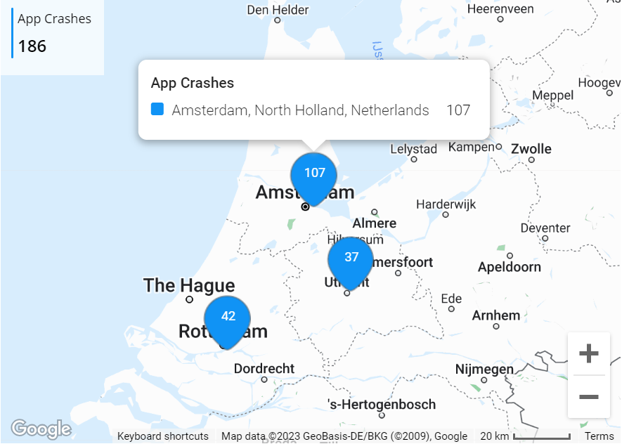
Hovering over a city, such as Amsterdam, reveals the city name and metric values.
Multiple Data Sources
Custom dashboards support multiple data sources, enabling comprehensive analysis across video streams, ads, and application performance within a single dashboard.
Creating a Dashboard with Multiple Data Sources
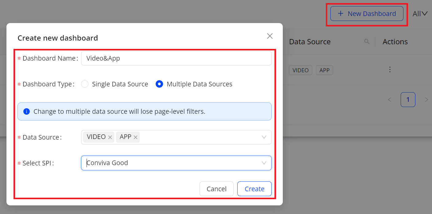
- On the Custom Dashboard main page, click Add New Dashboard in the top right corner. In the pop-up window, click Multiple Data Sources and select SEI and APP from the Data Source list, and click Create.
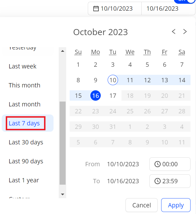
- From the date picker, select the time range, and click Apply. The default time range is Last 6 hours. In this use case, use Last 7 days.
- To go to the Add New Widget page, click New Widget.
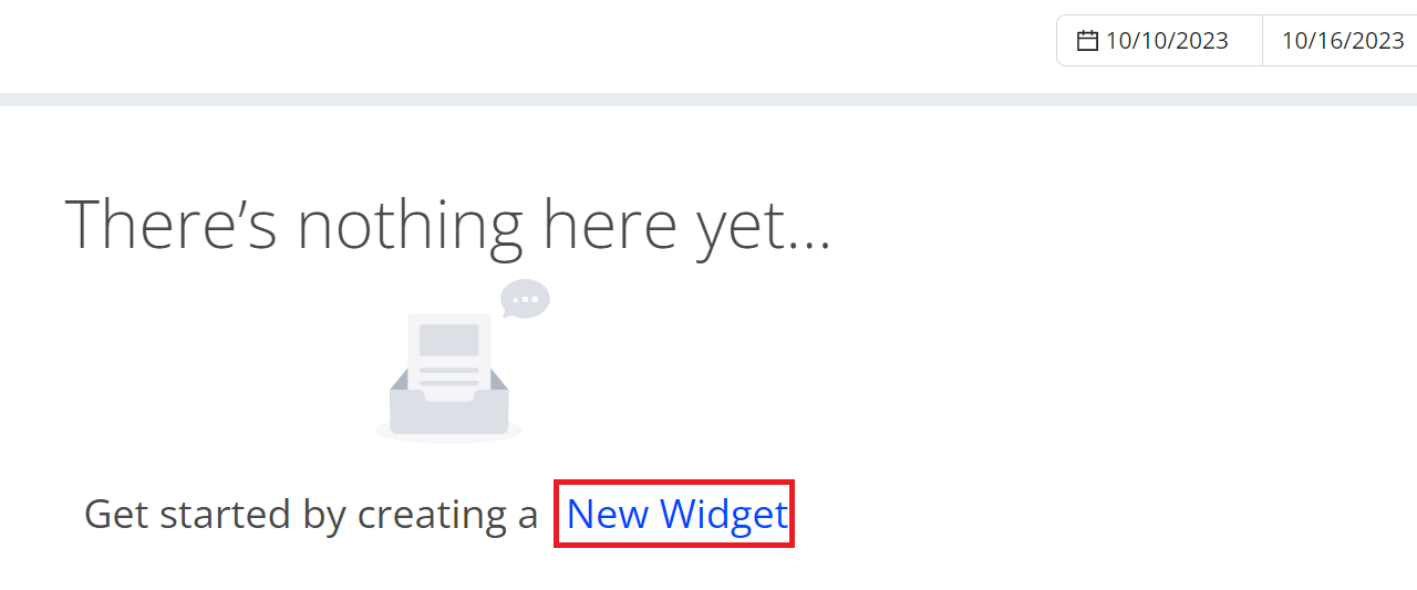
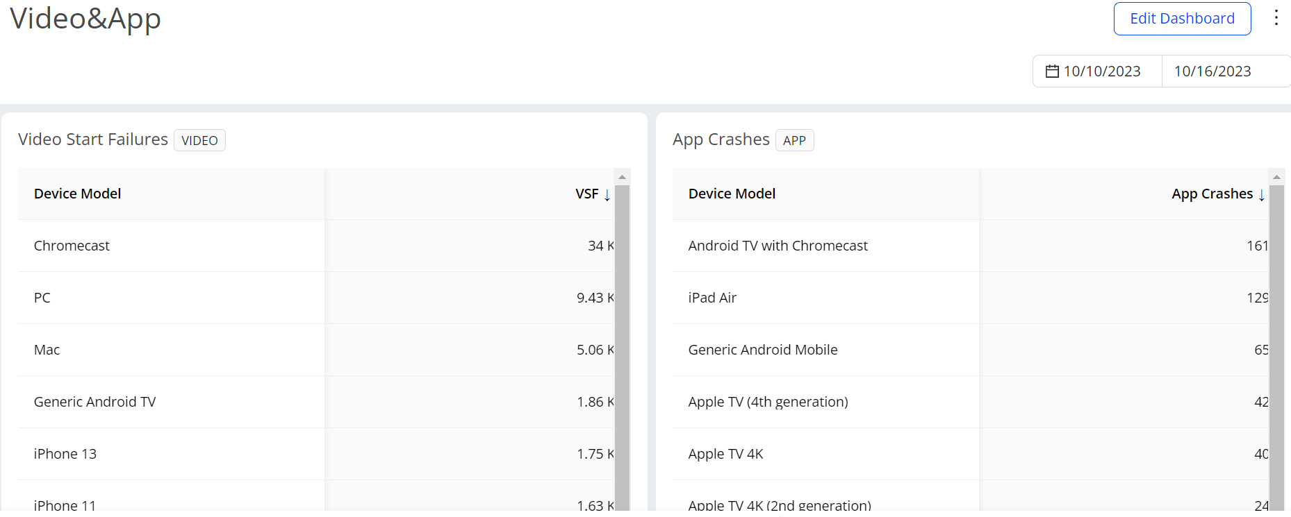
Fill out the fields, select the suitable items, and click OK. The table to track video performance displays in the widget.
Data Source: SEI
Widget Name: Video Start Failures
Visual Map: Table
Metrics: VSF
Dimension: Device Model
Fill out the fields, select the suitable items, and click OK. The table to track app performance displays in the widget.
Data Source: APP
Widget Name: App Crashes
Visual Map: Table
Metrics: App Crashes
Dimension: Device Model
Overall Analysis
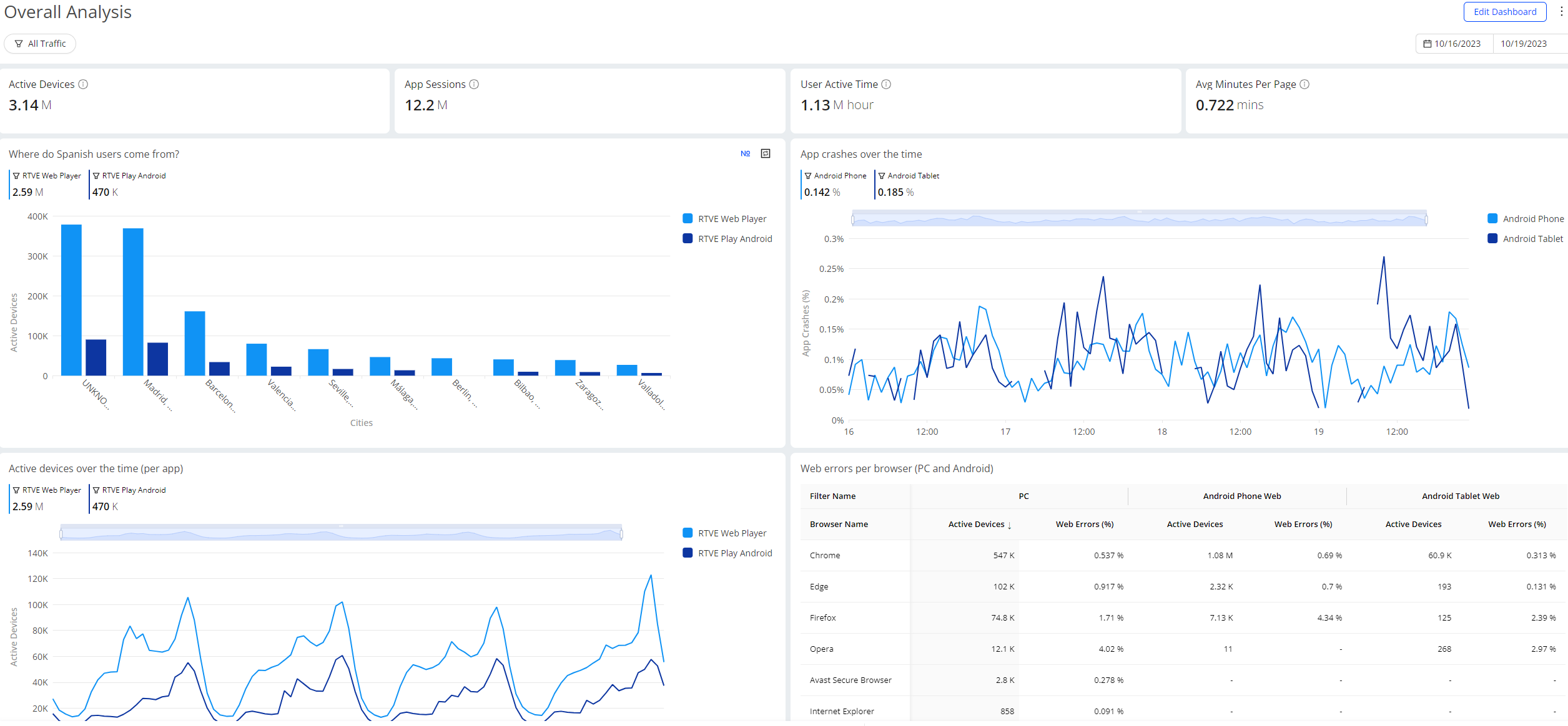
Custom dashboards analyze app and web performance and related factors, including the number of active devices, app crashes, web errors, and active devices over time. Different widget formats display the necessary metrics for comprehensive analysis.
Creating Widgets for Overall Analysis
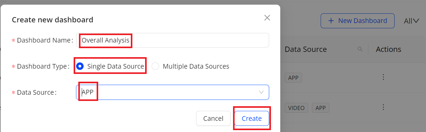
- On the Custom Dashboard main page, click Create New Dashboard in the top right corner, fill out the dashboard name, choose Single Data Source, and select APP from the Data Source list, and click Create.
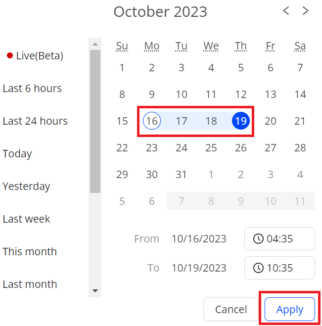
- From the date picker, select the time range, and click Apply. The default time range is Last 6 hours. In this use case, select October 16 and October 19.
- To add new widgets, click New Widget.
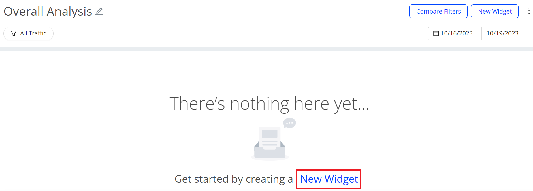
- Fill out the Widget Name field, select the suitable items, and click OK. Create widgets one by one based on the table.
| Widget Name | Visual Map | Filter Comparison | Metric | Dimension | Granularity | Filters |
|---|---|---|---|---|---|---|
| Active Devices | Summary Metric | N/A | Active Devices | N/A | N/A | N/A |
| App Sessions | Summary Metric | N/A | App Sessions | N/A | N/A | N/A |
| User Active Time | Summary Metric | N/A | User Active Time | N/A | N/A | N/A |
| Avg Minutes Per Page | Summary Metric | N/A | Avg Minutes Per Page | N/A | N/A | N/A |
| Where do Spanish users come from? | Bar | On | Active Devices | Cities | N/A |
|
| App crashes over the time | Time Series | On | App Crashes (%) | N/A | 15 Mins |
|
| Active devices over the time (per app) | Time Series | On | Active Devices | N/A | 5 Mins |
|
| Web errors per browser (PC and Android) | Table | On | Active Devices Web Errors (%) | Browser Name | N/A |
|
- Check data from the created widgets.