Create Custom Dashboards and Widgets
Creating Custom Dashboards
The toggle button in the top right corner controls dashboard display settings. It selects pages for display, enables or disables view functions in diagnostics, manages bar indicators in dimensions, and performs dashboard actions such as sharing. The quick toggle in the top right minimizes these sections.
- Click + New Dashboard, and perform these steps:
-
Enter a name for your dashboard in the _Dashboard Name_ field.
- Choose between Single Data Source or Multiple Data Sources based on your requirements, and click Save. Data sources include SEI, ADs, and App user experience, events, network performance.
Single Data Source: displays data from only the selected data source. For SEI, also choose which SPI threshold level. The default is Conviva Good.
Multiple Data Sources: displays data from all the selected data sources. For SEI, also choose the SPI threshold level. The default is Conviva Good.
SEI: Select *SEI* to get data from ConvivaVSI and create dashboards for tracking video performance. AD: Select *AD* to get data from Ad Experience and create dashboards for tracking Ad performance. App (User Experience): Select this option to get data from App and create dashboards for tracking user performance. App (Events): Select this option to get data from App and create dashboards for tracking events. App (Network Performance): Select this option to get data from App and create dashboards for tracking network performances.- (Optional) After creating the dashboard, select Settings by clicking the kebab icon in the edit mode to update the above settings.
-
In the edit mode, add widgets. For more details, see Using the Edit Mode.
To enable an error code table:
Click the metric name, such as VSF, to add the error code table with error breakdowns rather than aggregate totals.
Click the ‘New Widget’ button, select Error Code Table from the drop-down list and select the required fields, including Error Type.
Creating a Widget with a Error Code Table
Custom Dashboards offer two methods to create an error code table for advanced analysis.
To enable an error code table:
Click the metric name, such as VSF, to add the error code table with error breakdowns rather than aggregate totals.
Click the ‘New Widget’ button, select Error Code Table from the drop-down list and select the required fields, including Error Type.
Creating a Widget with a Map Chart
Custom dashboards display metrics and dimensions in a map chart format within widgets.
To create a widget in a map chart format, select Map from the Visual Type drop-down list when setting up a widget.
Add New Widget
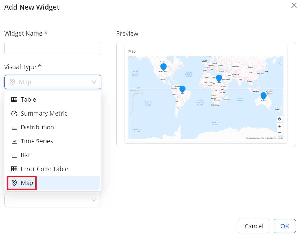
By default, the map chart displays the number of rows for different geo dimensions.
Cities: 50
Countries/Regions: 200
States: 50
On the top right corner of the created widget, the elements provide functions:
Row Limits field to set the number of values that can be displayed.
Advanced Filter icon to select values as advanced filters in the map.
View Table and View Chart icons to toggle between the visual view and the table view.
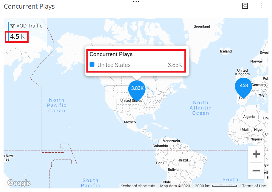
When creating a widget with a map chart, apply a filter to refine the displayed data. For example, use VOD Traffic as a filter to focus on metric values related to VOD traffic.
Edit Widget
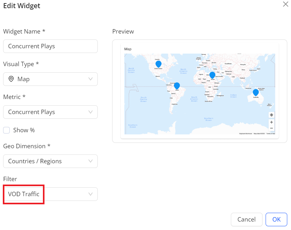
This image shows that the total concurrent plays for the VOD traffic are 4.5 K. Hovering over a country, such as United States, reveals the country name and metric values.
Add New Widget
Edit Custom Dashboards and Widgets
Editing Custom Dashboards and Widgets
After creating a custom dashboard or receiving edit permissions, change the dashboard name and access level based on the requirement, add or remove widgets, edit widget settings, rearrange widgets, and modify filter settings.
Select the Custom dashboard.
Click Edit in the kebab menu for the dashboard.
In the edit mode, update widgets. For more details, see Using the Edit Mode.
Using the Edit Mode
Edit mode saves changes to the dashboard, including adding a new dashboard, adding or removing widgets, editing widget settings, rearranging widgets, and modifying filter settings.
To edit the dashboard,
- Enter edit mode through one of the options:
Open a dashboard in the Viewer mode, and click Edit Dashboard on the top right corner.
Locate the dashboard in the dashboards list and select Edit from the kebab menu.
- Specify the new widget settings. Settings include data source, widget name, visual type, metrics, dimensions, and filters.
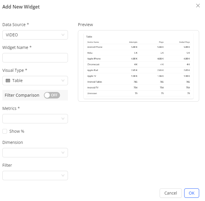
Data Source: (Optional) Select Multiple Data Source when creating the dashboard, and select the data source name from the Data Source drop-down list.
Widget Name: Text and special characters up to 256 characters
Ad Type: This drop-down list is available when selecting AD as a data resource in Step 1. Select an ad type from the drop-down list to specify the ads to track. Available options include All, Client Side, Server Side, and VPAID.
Visual Type: Table, Summary Metric, Distribution, Time Series, Bar, Error Code Table, and Map.
- Metrics: SEI metrics from the Trends dashboard.
Show %: In addition to the predefined percentage metrics, select the Show % check box for the metrics including Attempts, Ended Plays, Plays, Ad Impressions, and Ad Attempts, to display the metric values as percentages. For more information on setting the percentage mode, see Displaying Metrics in Percentage View Mode.
Dimension: Configured dimensions in your account
Filter: If turning off Filter Comparison, seelct a single filter from all saved filters in SEI. With Filter Comparison on, select multiple filters for comparison.
Add up to 20 widgets on each Custom dashboard.
- Select the desired widget options and click OK. The specified Custom dashboard appears. This example shows different display formats: summary metric, map, and bar.
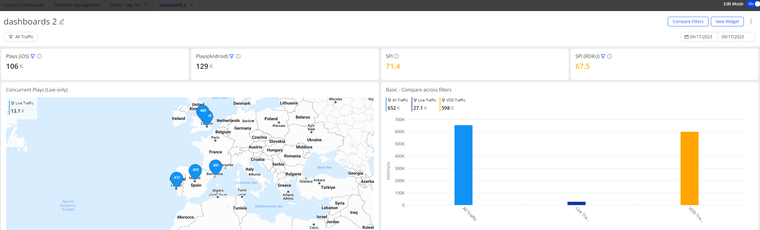
- To rearrange widgets, grab a widget near the title and drag it to a new position.
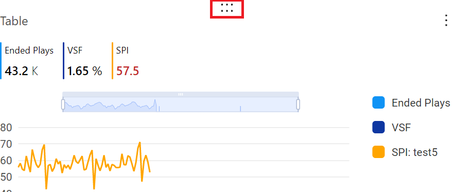
- To update a widget, click Edit in the kebab for the widget. The widget edit options appear, allowing modification of the settings.
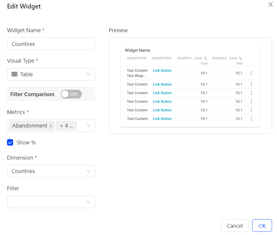
- After completing the changes, switch off Edit Mode on the top right corner. The edit mode is freed up and other users with edit permissions can use the mode.
Deleting Custom Dashboards and Widgets
Delete created Custom dashboards to manage the total number allowed per account. Periodically review existing dashboards and remove duplicates to prevent unnecessary additions.
To delete a custom dashboard, click Delete in the kebab menu for the dashboard.
To delete a custom widget, click Delete in the kebab menu for the widget.
Displaying the Custom Dashboards
Metrics in Percentage Mode
Custom dashboards easily display metrics in percentage view mode within widgets.
In the metrics drop-down list, select two types of metrics to display in percentage view mode within widgets.
- Metrics that display in pairs For some metrics, such as VPF, Conviva provides predefined versions, such as VPF (%), to enable percentage view mode. The drop-down list displays these metrics in pairs, such as VPF (%) and VPF. Select both metrics from the drop-down list to view them together in the same display. For more information regarding how to calculate the predefined metrics, see Metric Dictionary.
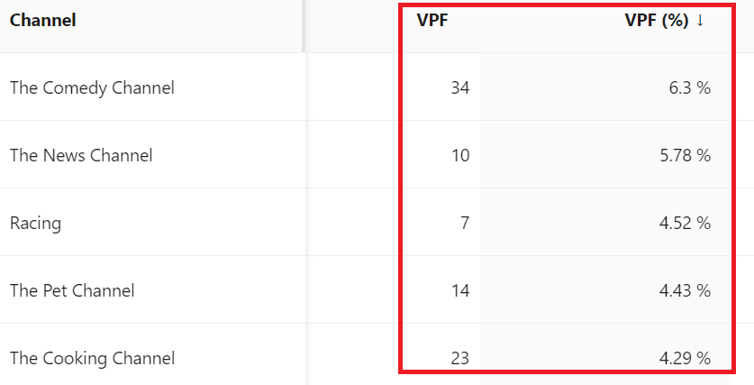
- Selected Metrics Show % check box to view as percentages in the widget In addition to predefined percentage metrics, selecting the Show % checkbox for metrics such as Attempts, Ended Plays, Plays, Ad Impressions, and Ad Attempts displays metric values as percentages. The percentage is calculated by dividing the result for each dimension value by the total number. Table Visual Type
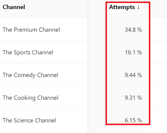
For example, in the above table, the total attempts for The Premium Channel are 5.41K and the total attempts for all channels are 15.5K. After selecting the Show % check box, Custom Dashboards use 5.41K divided by 15.5K to calculate the percentage and show 34.8% as a result. Time Series Visual Type
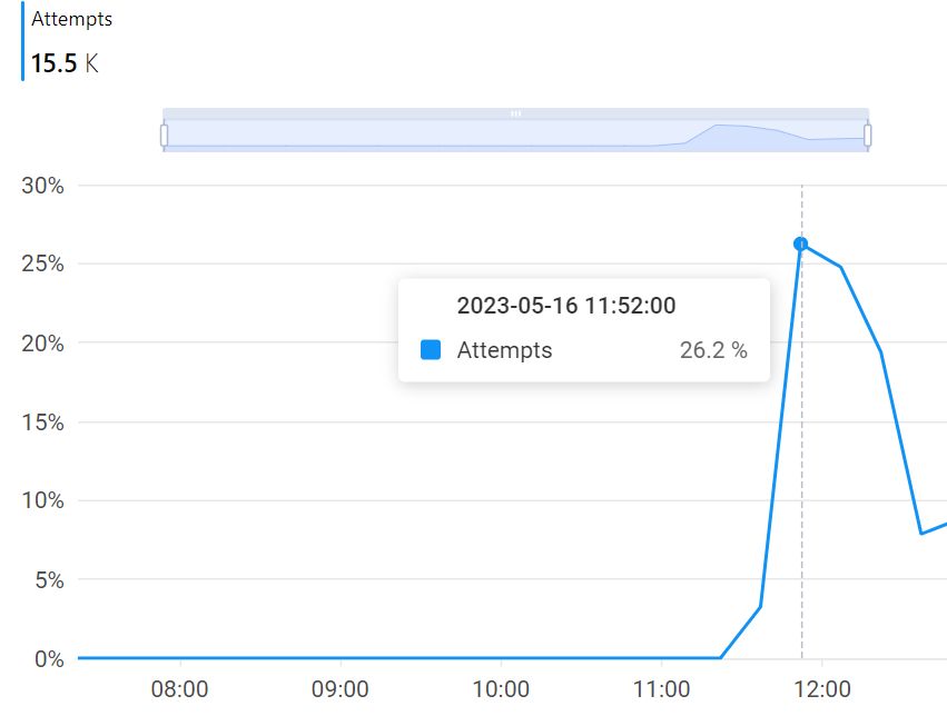
In the above line chart, the total attempts at 11:52:00 are 4.08K and the total attempts for all selected interval are 15.5K. After selecting the Show % check box, Custom Dashboards use 4.08K divided by 15.5K to calculate the percentage and show 26.2% as a result.
Drilling Down to Trends
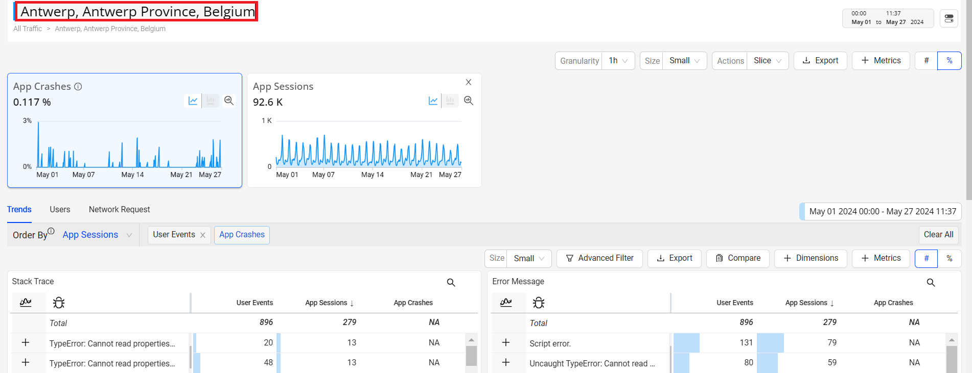
Custom dashboards provide the enhanced view of the selected metric along with the dimension data updated based on the filter applied.
- Hover over any dimension value on the widget to display the Focus button. The Focus Button
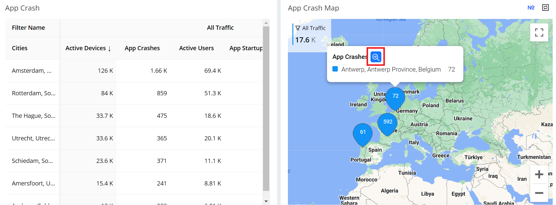
- Select the Focus button to apply the selected dimension value as a filter in the Trends dashboard for enhanced viewing. The displayed Trends dashboard provides in-depth data analysis. Opened Trends Dashboard
Real-Time (Live Mode)
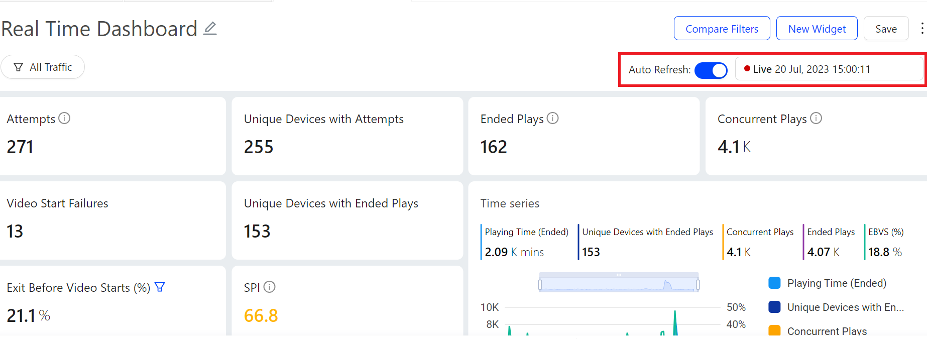
Use the updated date picker to select the live mode. The Live mode shows the time series along with the aggregated metric numbers and percentages on the metric widget aligning the aggregate values with the metric values in the dimension table.
The real-time live mode supports 10 second data refresh with less than 30 seconds latency, based on a 10-second tumbling window.
Real Time Dashboard
Sharing Cloning and Export Dashboards
Sharing Custom Dashboards
Sharing Custom dashboards allows the dashboard creators to decide who can view and/or edit on the dashboard they created.
To share a Custom dashboard, click Share in the kebab menu.
Select the appropriate sharing option from the drop-down list of the pop-up window:
Private: Only creator can view and/or edit the dashboard.
Only specific people can view or edit: After choosing this option, select at least one email address other than yours, specify their access level as Can Edit or Can View as needed, and click Add.
Anyone can view, only some can edit: After choosing this option, select at least one email address other than yours, specify their access level as Can Edit, and click Add.
- Anyone can view and edit: Any users with accesses to current c3 accounts can view and edit this dashboard.
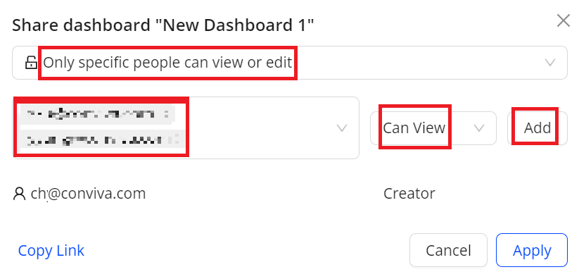
- (Optional) To obtain a link to the dashboard, click Copy Link.
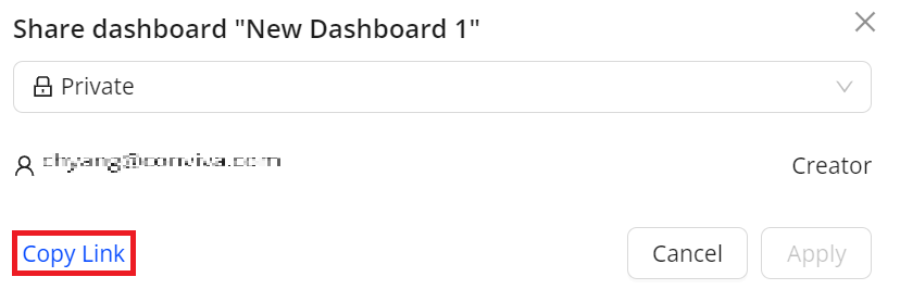
- To apply these settings, click Apply.
Cloning Custom Dashboards
Create copies of existing Custom dashboards, whether created or shared. Cloning dashboards simplifies the process of re-creating similar dashboards.
To clone a Custom dashboard, click Clone in the kebab menu.
Specify the new name and access setting. Click OK to save the new dashboard. Otherwise, click Cancel.
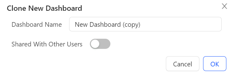
Exporting Data in CSV
Export Custom dashboards data in the .csv format for off-line access and integration with other data.
Customize the export data based on a time range and combinations of filter settings.
If the time range and filter settings already meet your requirements, click Export from the kebab menu of the dashboard to export Custom dashboards data.
To customize the time and filter settings before exporting, perform the steps:
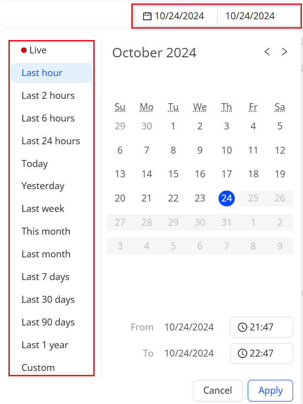
- To specify filtering criteria, use the filter settings.
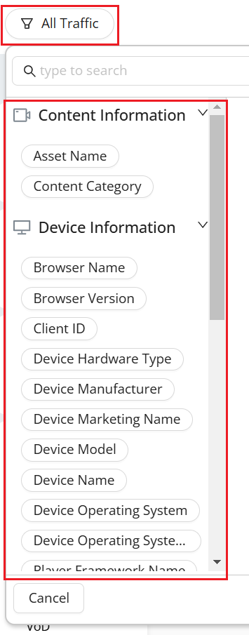
- To export Custom dashboards data, click Export from the kebab menu of the dashboard.
For how to schedule reports with CSV files, see Scheduling Custom Dashboards.
Scheduling Custom Dashboards Email
As a dashboard owner or viewer, schedule email delivery of the Custom dashboards for up to 200 email addresses, include alias email groups. This delivery enables flexible access to impactful viewer experience and performance insights from mobile phones and other types of devices as extensions of the Conviva application.
- To set up scheduled email delivery of a custom dashboard, from the kebab icon select Schedule.
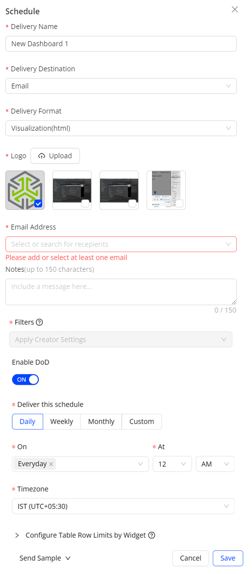
- Specify the name, logo (for html delivery format), delivery format including html, CSV, and PDF, and recipient email addresses. Paste a list of up to 200 email addresses separated by commas, semicolons, or spaces.
Select the filter and time range settings.
Apply Creator Settings: Applies the filter and time range specified by the dashboard creator. Creator updates apply to all incoming deliveries. For example, if the creator modifies a dashboard time range from Yesterday to Last 7 days, the Last 7 days update applies to all incoming deliveries, even if the users had modified their filters or time range.
Apply My Current Settings: Applies the filter and time range specified by the user, independent of the dashboard creator settings. Creator updates do not override any applied user settings. For example, if the creator modifies the dashboard time range from Yesterday to Last 7 days, the users modified settings at schedule creation still apply to their filters and time range.
(Optional) Enable DoD: Select the toggle to compare the dimensions and metrics for the selected date and time range. By default, the schedule shows data for the last hour.
Select the delivery frequency as Daily, Weekly, Monthly or Custom with a selected date range, then specify the timezone to decide when to trigger the scheduled delivery.
(Optional) Choosing the HTML delivery format allows configuration of table row limits by widget. By default, the row number is 5 and the maximum number is 200.
Select one of the options from the "Send Sample" drop-down list to receive a sample delivery of the custom dashboard for validation.
Self: Send the sample to yourself.
All: Send the sample to all selected recipients.
Executive Email (Daily) Template
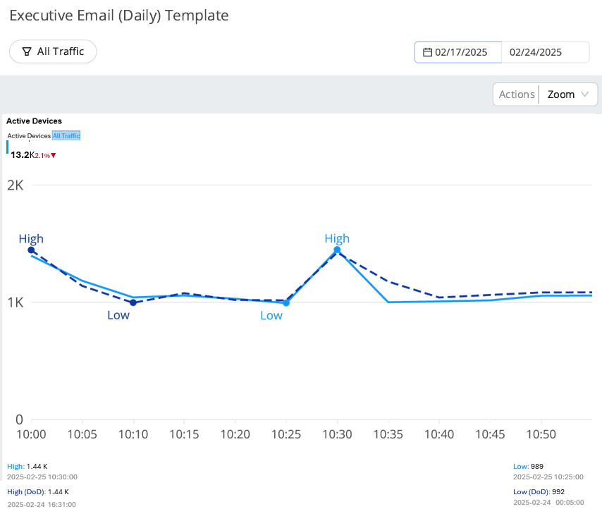
For information on custom dashboards in SEI and App, see Custom Dashboards in SEI and Custom Dashboards in App.
Transition Exec Emails 2.0
Executive Email 2.0 reached end-of-life on 22 May 2025. The Schedule Management feature in the Custom Dashboards replaces it and supports enhanced capabilities such as Date Compare.
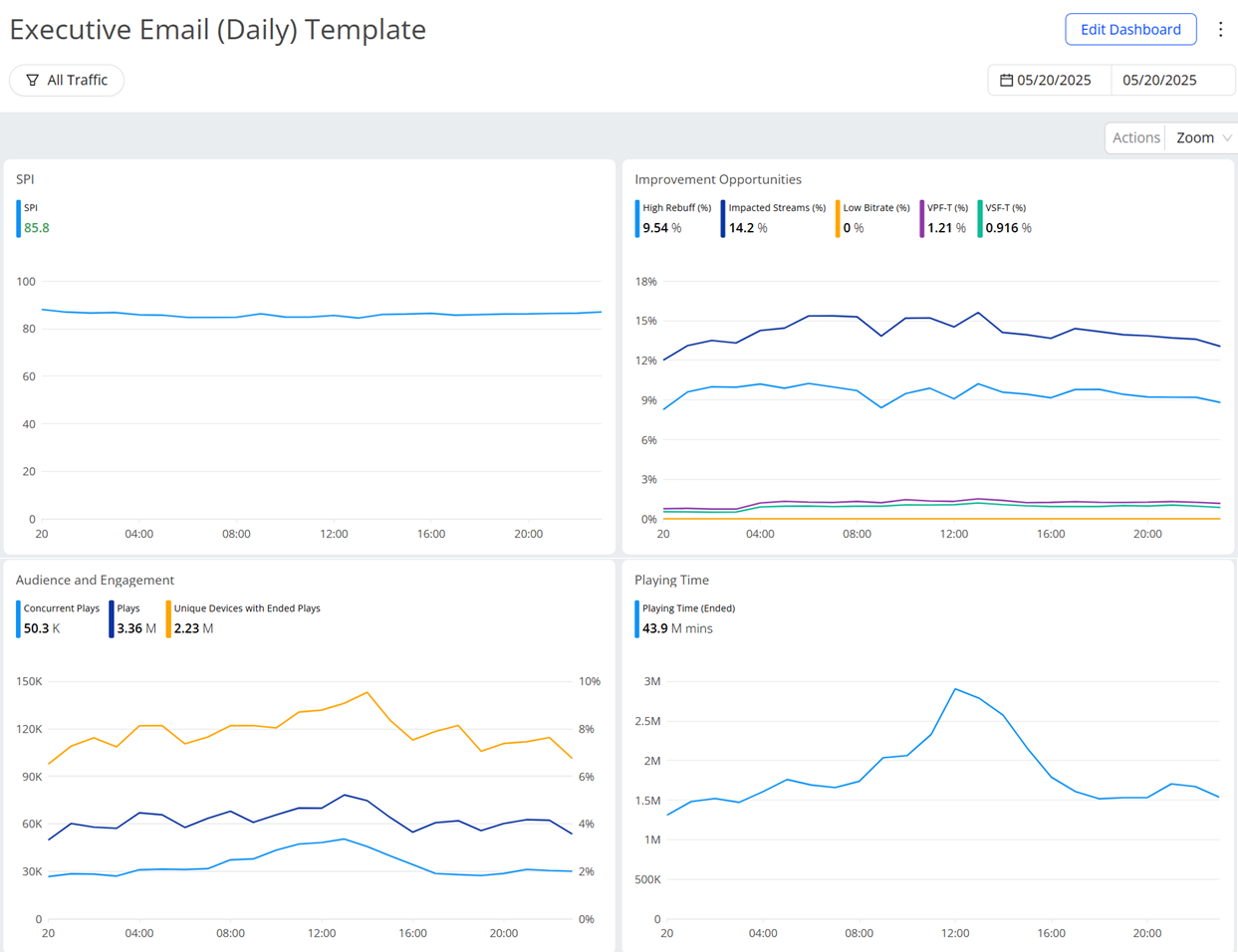
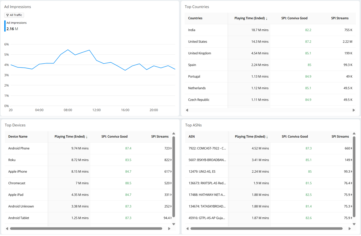
The following sample shows a custom dashboard to replace the Executive Email data with widgets for SPI, Improvement Opportunities, Top Devices, and other data.
Use the reference configuration to set up scheduled email delivery.
Click +New Dashboard.
Select Multiple Data Sources, choose SEI and APP, and click Create.
Set the Time range, and click New Widget
Create the Time Series widgets as per the below images.
Click to expand the image