Trends
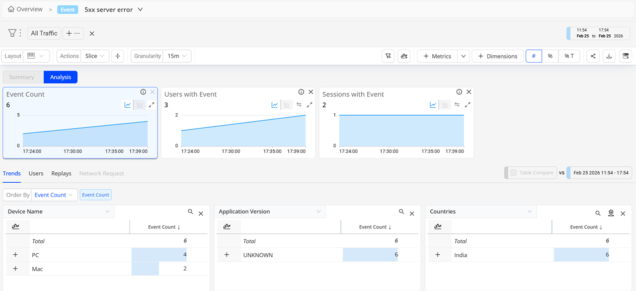
The Trends dashboard provides an easy-to-use interface with an advanced feature set, enabling real-time and historical, real-user experience monitoring connected wth backend network service performance for deep understanding of how application performance and network service health impacted user experience. Customized dimensional drill-downs support app and user experience Service Level Indicators (SLIs) based on engagement metrics, QoE and KPI metrics, service performance metrics, and error messages, along with detailed network request and user timeline analysis.
Watch this quick intro, and learm more about Trends features and use cases.
Click to Preview Trends Features
Watch Trends Overview
- What's New
- Basics and Tasks
- Preset Analytics
- Use Cases
What's New in Trends
 Trends: Percentile Aggregation for Duration, Metrics (Beta) -- (Jan 2026)
|
|
Feature Update:
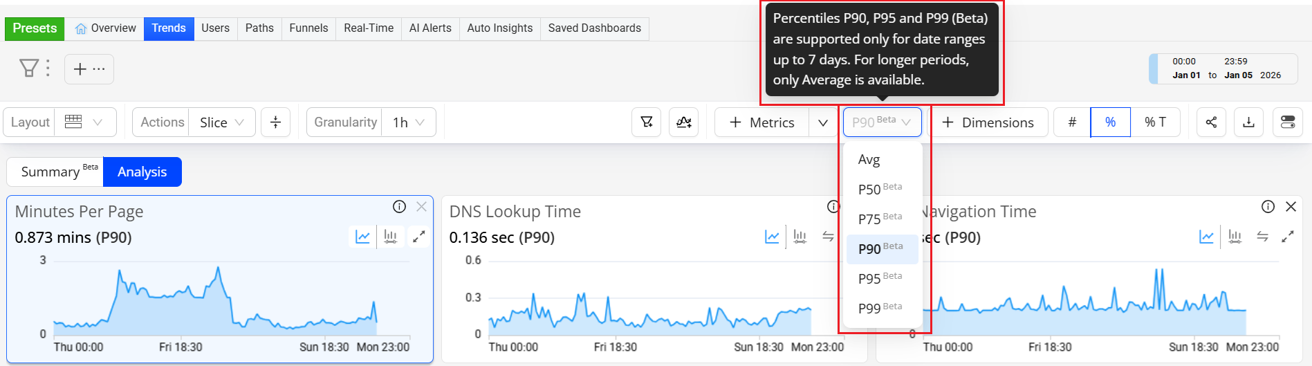
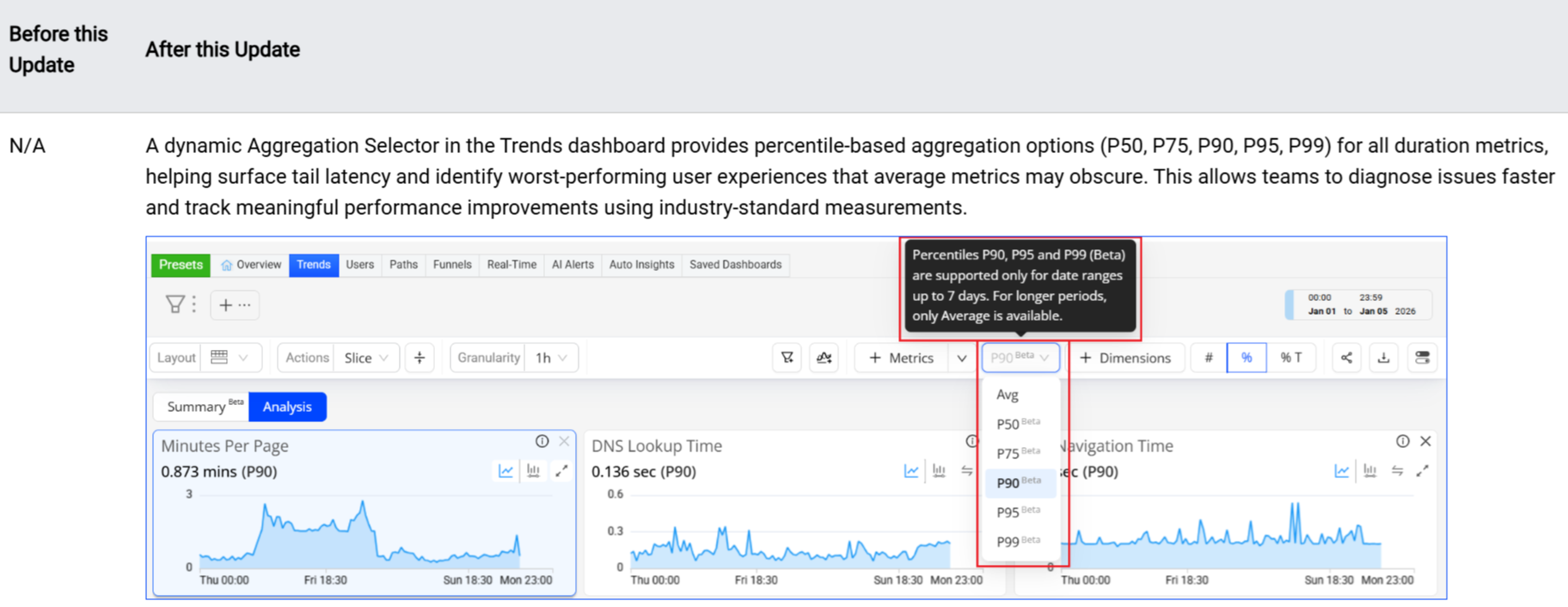
Adds a dynamic Aggregation Selector to toggle between percentiles and averages in the Trends dashboard, enabling percentile-based aggregation (P50, P75, P90, P95, P99) for Duration metrics to gain a more precise view of duration performances.
Click to expand the image
Use Case:
Using the P95 metric value for Soft Navigation Time helps identify slow client-side navigations that affected a small (5%) but meaningful subset of users. While average soft navigation time may appear acceptable, P95 reveals routes, devices, or browsers where in-app transitions took significantly longer than most other app transitions, impacting perceived responsiveness. Going beyond the average value, percentile values enable teams to isolate and optimize client-side rendering or script execution issues that degrade the user experience.
More Details: Trends.
Trends: Enhances Flow Analysis with Page and Screen Dimensions -- (Oct 2025)
|
|
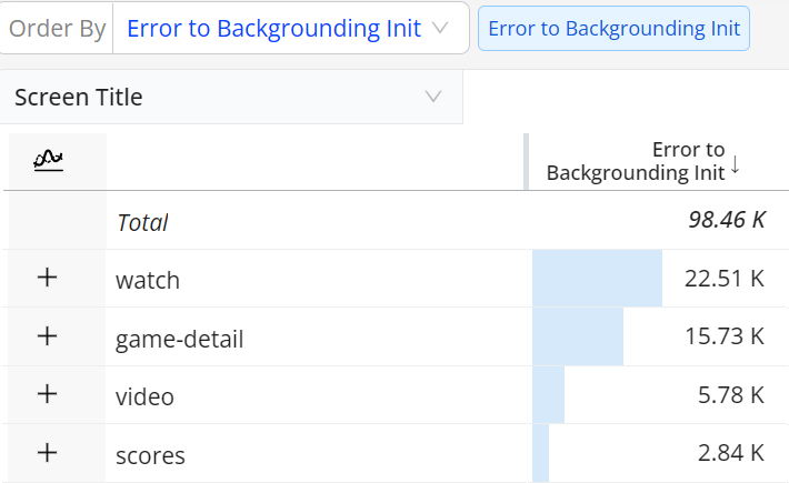
Feature Update:
Adds support for associating predefined dimensions (Page Host, Page Path, Page Title, Page Referrer, Referrer Host, Screen Title, Previous Screen Title) with Flow metrics, enabling improved Flow drill-down analysis across related dimensions.
Click to expand the image
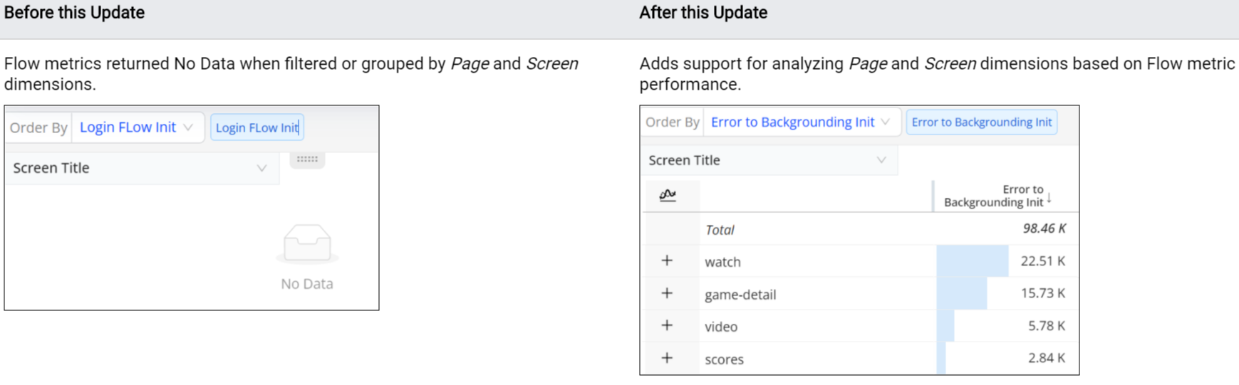
Use Case:
Use Page dimensions to highlight Flow performance across multiple pages. For example, with the Login Click to Success Flow selected in Trends, select the Page dimension and apply Flow metrics (Inits, Flows with Errors, Errors in Abandoned Flows) to the dimension table to analyze the performance of these metrics across Page dimension values.
More Details: Flows.
Trends: Updated Calculation of Critical and Non-Critical Error Percentages -- (July 2025)
|
|
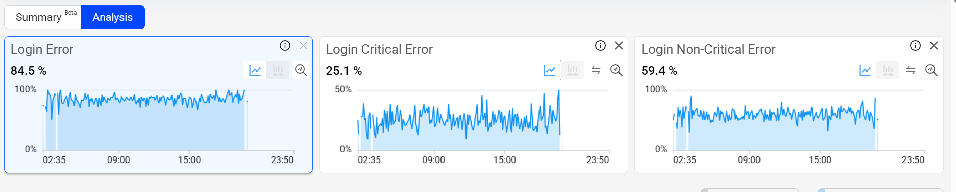
Feature Update:
Updates the calculations for Critical Error %, and Non-Critical Error % to align with the overall Error %. This update improves clarity and consistency in error reporting.
Note: Error %: Number of Flows with errors divided by the total number of Flows.
Critical Error %: Number of flows with critical errors that caused the conversion to fail, divided by the total number of flows.
Non-Critical Error %: Number of Flows with non-critical errors divided by the total number of Flows.
Click to expand the image

Use Case:
Add ASN and ISP as dimensions in the dimension table. Select an ISP as a primary filter to see the associated ASNs. Check the associated metrics and other dimensions to detect any anomaly (if any).
More Details: Trends.
For more details about these and other DPI updates, see What's New in DPI.
Trends Dashboard Settings
Trends Dashboard Settings
Display Settings (Page Sections, View in Diagnostics, View in Dimensions, Actions, Layout in Trends)
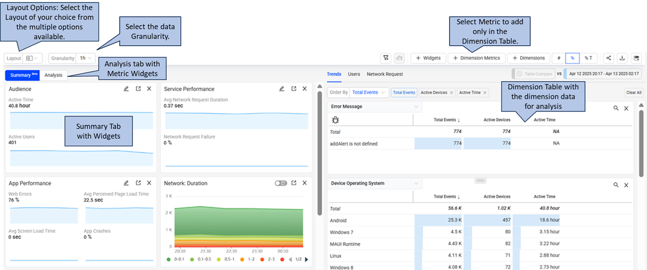
The toggle button at the top right corner selects pages for display on the dashboard, turns on or off view in diagnostics, controls bar indicators in dimensions, and performs actions like sharing the dashboard. Use the quick toggle in the same area to minimize sections on the page.
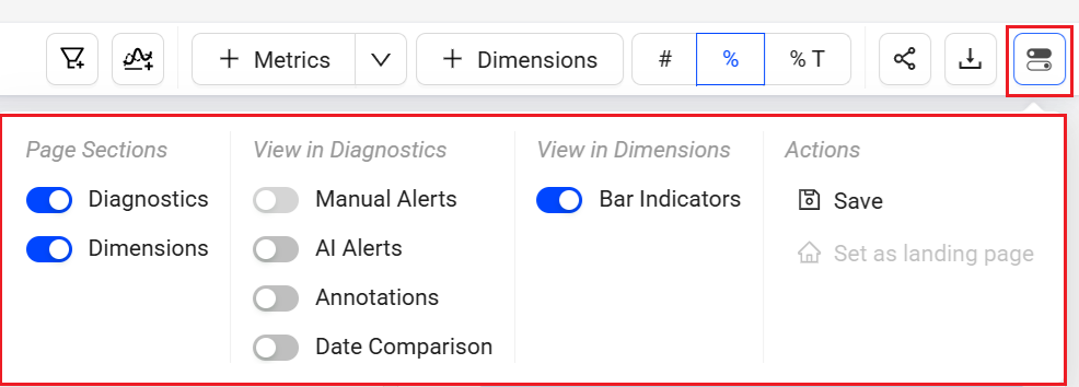
Page Sections (Diagnostics and Dimensions)
The Trends features a two-layout structure consisting of a diagnostics, and dimensions.
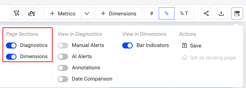
-
Diagnostics: displays detailed metric time series widgets. These diagnostics widgets mainly provide these functions:
-
Dimensions: Select Dimensions to display dimensional data, including trends data and user data. This data supports the analysis of app performance and user behaviours. For more information, see Dimensional Data (Trends and Users).
View in Diagnostics (Alerts, Annotations, and Date Comparison)
The Trends enables AI alerts and date comparison to present detailed information in metric widgets.
AI Alerts
Date Comparison
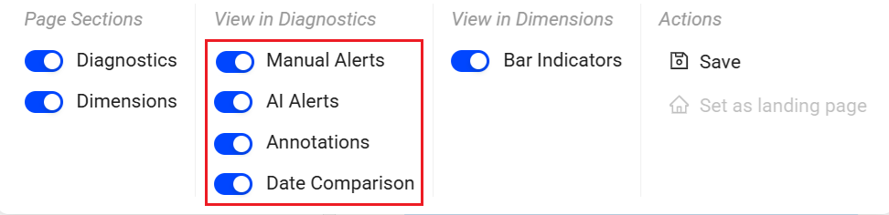
AI Alerts
This option displays AI alert markers in the time series to indicate error conditions and link to alert diagnostics.
Annotation
Annotations allow marking anomalies in the timeseries during data analysis within the selected time interval in the Trends dashboard and Compare. The annotation also provides the option to add comments and support collaboration.
Add and save the annotations in the following two levels:
Metric: Annotation is visible for selected metric across all dashboards.
Dashboard: Annotation is visible for all metrics across all dashboards.
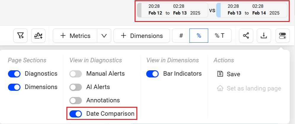
Date Comparison
Date comparison displays comparative performance data for quick analysis across periods. The selected filter settings, such as All Traffic, define the metric and dimension values and must align with the intended data set for time series comparisons.
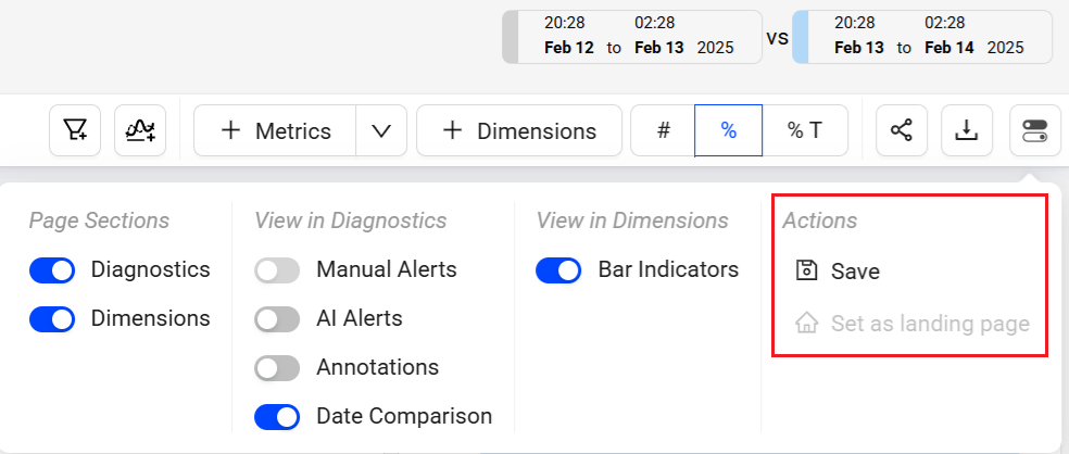
Actions (Save, Set the default page)
The Toggle menu in Trends enables saving the dashboard and setting Trends as the default page.
Saving Trends Dashboards
Save the Trends dashboard for reuse and collaboration with other users.
There are two options to save the dashboards:
My Dashboards (Private Dashboard): visible only to the owner
Public Dashboards: visible to all users
The system adds the newly saved public dashboard to the Public dashboard list. The list also allows sharing the dashboard with other users with view-only permissions. After saving the dashboard, only the owner can edit the data.
To save the Trends dashboard,
-
Click the Kebab icon on Trends page and select Save.
-
On the Save Dashboard screen, give a name to the dashboard. To save this as public dashboard, select the Make it Public checkbox and click Save.
The saved dashboard appears in the Public Dashboards list.
Sharing Trends Dashboard
Click the Share icon in the action toolbar to share snapshots of dashboards with other Conviva DPI users. Clicking the Share icon saves a 30-day snapshot of the item and generates a link for collaboration, shared by copying and pasting the link.

Note: Special characters and emojis are not supported in the shared links.
Clone
Cloning a saved dashboard creates a copy of the dashboard, enabling customization based on the original dashboard settings, for example, expanding the date range. This feature simplifies collaboration and updates while preserving the original saved dashboard.

For more information on cloning public saved dashboards, see Public Saved Dashboard; for cloning private saved dashboards, see My Dashboard.
Export
Export the data in .csv format using the Export option in the action menu or the action bar.

To quickly check the event composition, click the information icon in the Metric Widget. For further metric details, click the metric name link to display the Activation metric detail page.
For the metrics of User Login and Subscription, either add new events or edit the mapped events metrics to update and activate the metrics. For more information, see Activating Metrics.
Create user-defined metrics directly in the DPI dashboard. For more information, see Creating User Defined Metrics.
Metric Widget Options
The Diagnostic Metric Widget provides multiple options:
-
Re-position and resize widgets for efficient cross-metric analysis.
-
Adjust widget sizes and remove metrics without relying on the metric panel.
-
Switch to Focus mode to enhance the metric view of a selected metric.
-
Use Trends distribution mode to discover how streaming sessions affect the overall metric value. This helps in discerning whether the metric value reflects consistent session behavior or if session outliers cause variance.
-
Include both Manual and AI alert specifics in the metric display, offering a comprehensive perspective on both types of alerts.
-
Annotate anomalies in time series to highlight data analysis points in time series.
-
Use the Slice option in Trends dashboard to select a portion of the time line, which then replicates the same time line portioning across other displayed metric widgets.
-
Zoom in on the time slice of data in one metric widget, which then selects the same time slice in the other widgets.
Note: For easy access zoom and select in one step using Zoom to Select.
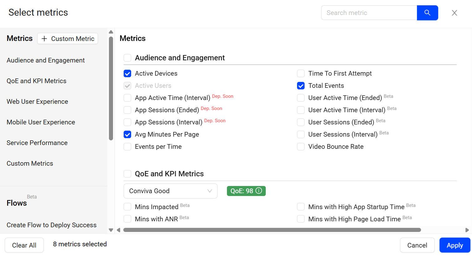
Trends offers the option to select metrics from the metric pop-up page. Alternatively, use the search bar to locate and select metrics based on a search query.
Advanced Data Selection
Drag and drop metric widgets to improve visual comparison. Within a metric widget, drag to select a portion of a time series or distribution to focus the analysis on only the related app sessions. This zooms the displayed data across all the widgets, dimension areas, sessions, and users to only the focused session data.
Within a distribution, drag to select distribution bars to add an advanced secondary filter based on the selected app sessions. Secondary filtering enables analysis based on specific metric performance, such as only app sessions with average minutes per page greater than 30 seconds.
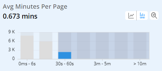
The distribution selection also displays the related metric in the dimension tables for easy impact analysis. In this case, Avg Minutes Per Page is highlighted and enables a quick determination of top page URL use.
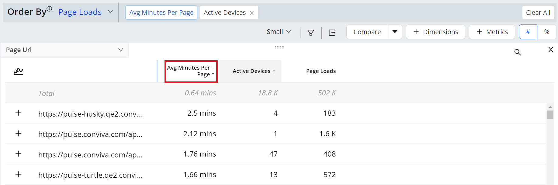
After slicing and dicing the data, click a dimension value to focus the data on that specific value. For example, clicking the most used page URL limits the displayed data, enabling analysis of that dimension value across other dimensions and through dimensional drill-downs.
Note: Drill downs on the VST metric in the distribution view show only sessions that started during the selected timeframe. This restriction focuses on video startup performance for only sessions that began within this interval.
Focus
Click the Focus icon in a metric time series to display an expanded view of the time series above the trend data. For both Flow Average Duration and custom metrics, click the Focus icon in distributions to use the last bucket to identify and analyze problematic cohorts. For example, apply the last bucket as a secondary filter to explore issues like errors or network delays in users with unusually long durations.
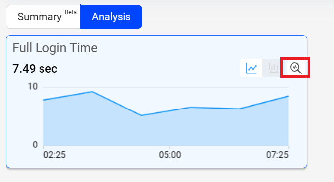
The focused view of the metric provides the enhanced view of the selected metric along with the secondary metric details. Clicking the distribution icon to see the distributed view of the time series.
Distributions quickly reveal the significance of each metric per session. They illustrate the impact of streaming sessions on the overall metric value, indicating whether the metric reflects consistent session behaviour or if outliers cause session variance.
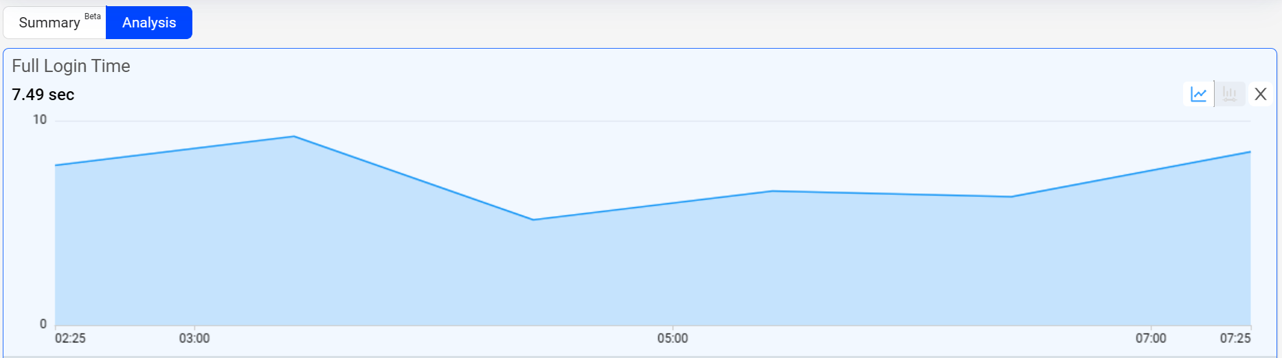
Dynamic Y-Axis
Dynamic Y-axis narrows the granularity of the y-axis range to focus more precisely on the displayed data points. Pulse calculates the maximum and minimum values, adds appropriate buffers, and determines whether to include the zero position in the y-axis. Excluding the zero position can be especially helpful in interpretting scatter charts.
Note: Y-axis adjustments are not available when the data range is too large or contains zero values.
For example, the y-axis range changes from 0 – 100 to 50 – 100 when data points fall only between 60 and 100.
To add Dynamic Y-Axis to time series,
-
Select the desired metrics and click Dynamic Y-Axis icon.
Image: Dynamic Y-axis icon
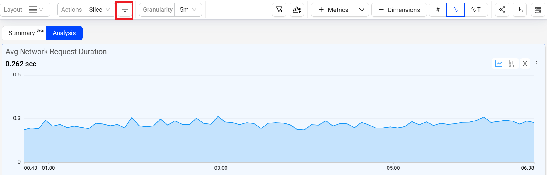
Dynamic Y-axis displays more focused axis points
Image: Dynamic Y-axis displays more focused axis points
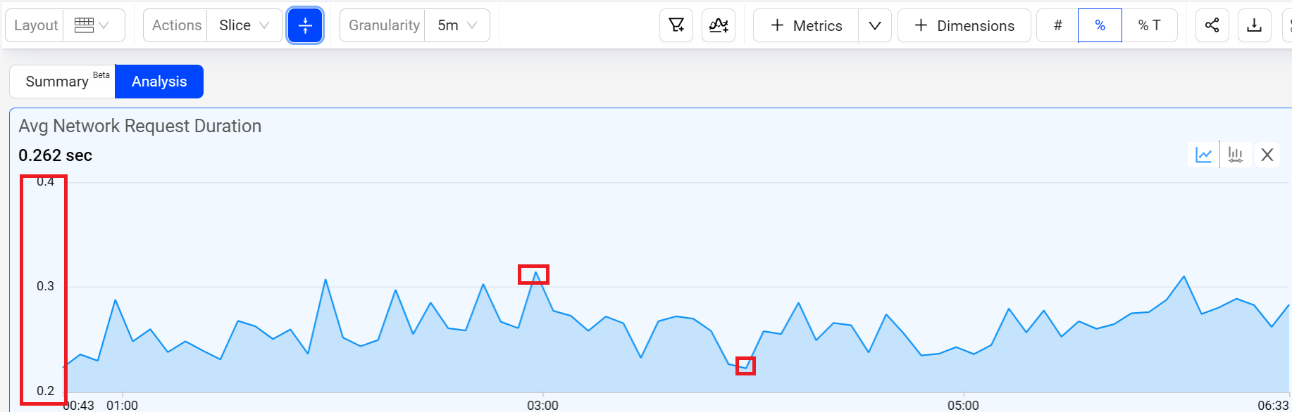
In this example, the y-axis points start at 0.2 and end at 0.4, based on the minimum data value in the time series of 0.223, and the maximum value of 0.315 with added buffer. This adjusted display offers more precise insights into the timeline data points, enhancing the data analysis.
Only one secondary filter can be applied at a time.
When applying the metric filter to a metric, it presents the secondary metric alongside the Active Devices companion metric, facilitating further comparative analysis within the dimension tables. This table displays all metrics eligible for the metric filter and their respective secondary metrics.
| Metric Name | Secondary Metric |
|---|---|
| Avg Minutes Per Page |
[SF] page loads [SF] page loads % |
| Avg Network Request Duration |
[SF] Network Request Count, [SF] Network Request Count % |
| Avg Page Load Time |
[SF] Page Load Complete, [SF] Page Load Complete % |
| Avg Screen Load Time |
[SF] screen loads, [SF] screen loads % |
| Mobile App Startup Time |
[SF] App startup count, [SF] App startup count % |
| Time To First Attempt |
[SF] App sessions [SF] App sessions % |
Here are some use cases:
-
Examine instances where app sessions exhibit higher-than-normal metrics, such as average page load time, network response duration, screen load time, time per page, app startup time, and time to first attempt.
-
Evaluate the magnitude of the impact to effectively prioritize resolutions.
-
Identify the specific network request URLs responsible for prolonged load times.
-
Investigate the error codes linked to these network requests and assess their impact.
Using Metric Filters
To add an additional layer of analysis on data with an applied primary filter for analyzing distribution data, follow the steps to create a metric filter.
-
Click the Distribution icon on the metric widget.
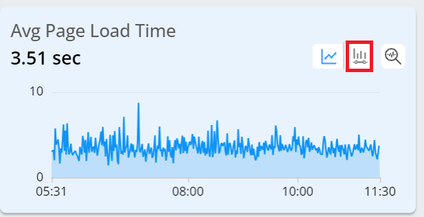
-
Select a distribution bucket.
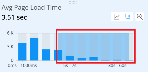
Note: This creates a metric filter and filters the data in all the other metric widgets, displaying the primary filter and the secondary trends in the time series.
-
Check the data.
-
Check the metrics calculated based on the data filtered by the secondary filter.
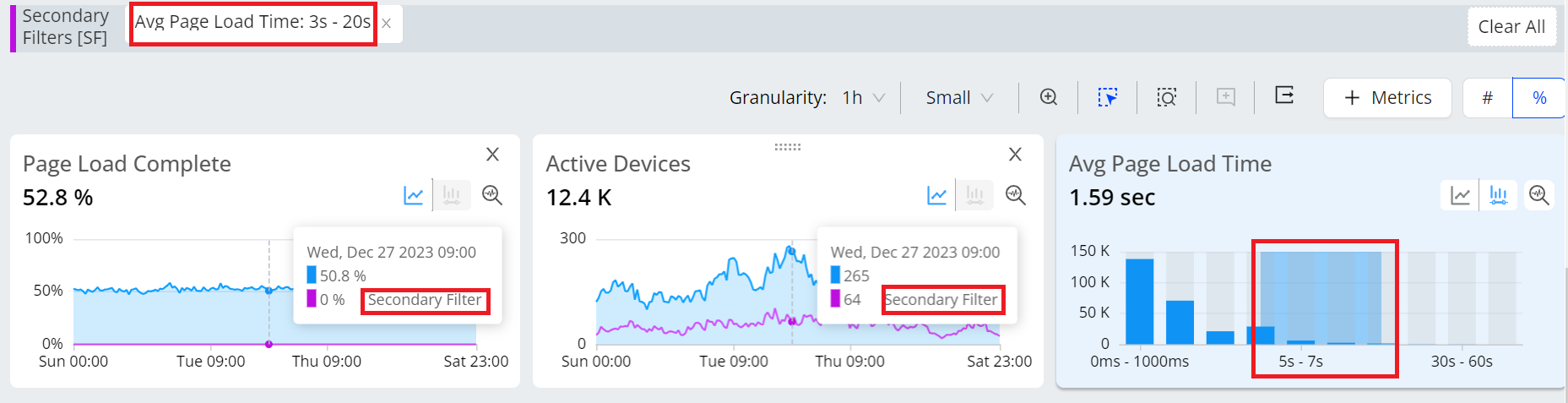
-
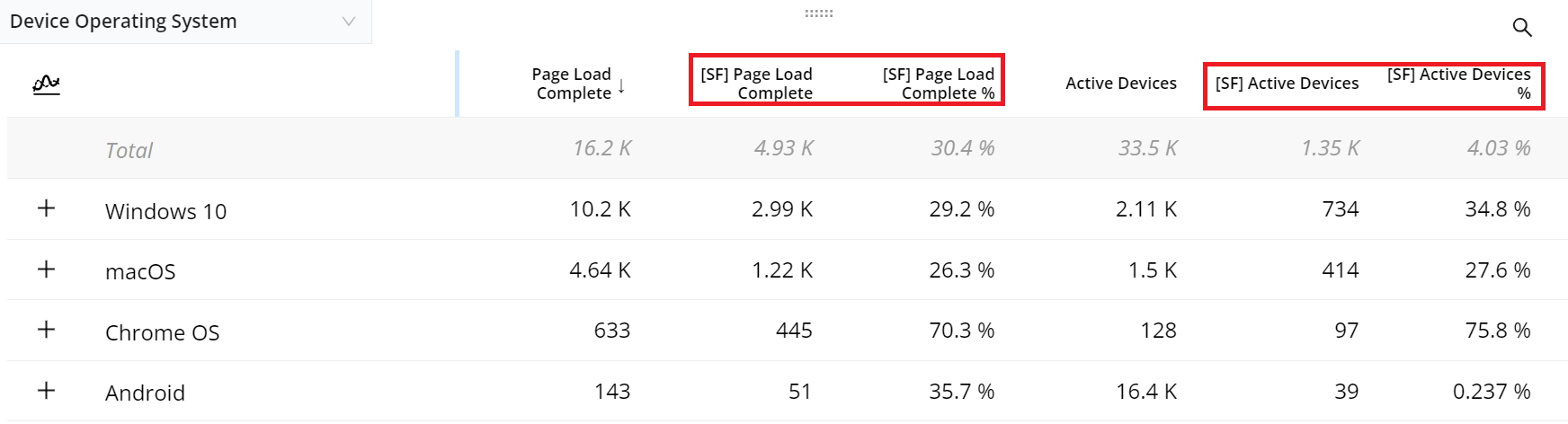
Check the dimension table to analyze the primary metrics along with their secondary/companion metrics.
Note: To enhance the analysis of custom metrics, DPI displays secondary custom metrics in the dimension tables using <metric_name> Init# for conversion metrics and <metric_name> Complete# for duration metrics. <metric_name> Init# shows the number of times the initial event was performed; <metric_name> Complete# shows the number of times both the initial and follow up events were performed, based on the successful and failed pairs from the first initial event to the first follow-up event.
-
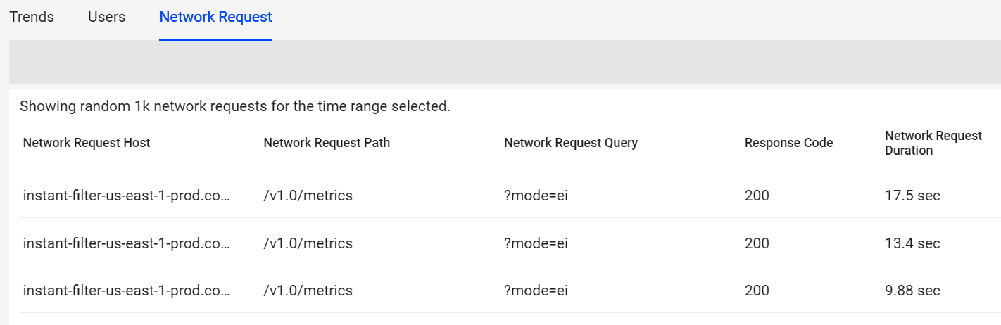
Check the data related to network requests from the Network Request tab. Hover over a network request path and click the service performance icon for detail performance and root cause analysis.
Note: When performing a drill down under the Network Request tab with the metric filter, be aware that the applied filter is specific to this tab and is only visible here. The global filter does not reflect the drill down performed under the Network Request tab.
-
Note: The Custom and Flow Duration metrics also support the Secondary filters.
Changing the time granularity in Trends stores the selection in the system, which retains it after logout and login, as long as the granularity remains valid for the selected time range.
The new granularity drop-down next to the time picker provides an option to select the granularity level for the current display.
Data Dip for Partial Data
Note: The last partial data distribution is deleted if there is a delay in data ingestion, no data availability from the source, or partial data in the last time range bucket based on the selected datetime range and granularity.
For example, the date picker sets the range from July 17 at 20:56 to July 18 at 02:53 with a granularity of 5 minutes. The last time series data bucket spans from 20:56 to 02:46, resulting in only 7 minutes of data, which would likely cause a dip in the time series due to partial data availability. Therefore, the partial data in that data bucket, which would cause an observable drop or dip in the last data bucket in the time series, is no longer shown.
Real-Time (Live Mode) in Trends
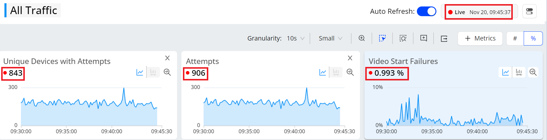
Use the updated date picker to select the live mode. The Live mode shows the time series along with the aggregated metric numbers and percentages on the metric widget aligning the aggregate values with the metric values in the dimension table.
The real-time live mode supports 10 second data refresh with less than 30 seconds latency, based on a 10-second tumbling window.
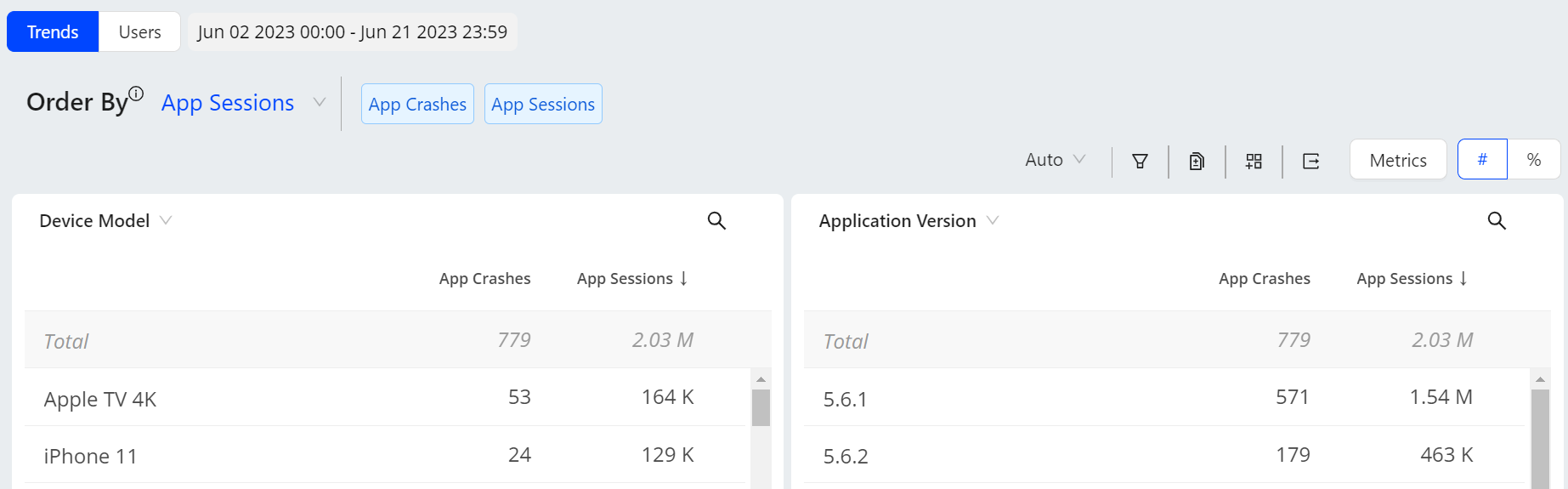
Time Series and Drill Downs
The NA metric value appears when a metric value cannot be calculated by the application, for example, screen load time for a web page dimension or impacted time for a trace id dimension. The Unknown dimension value appears when the dimension value cannot be determined, such as an unnamed browser.
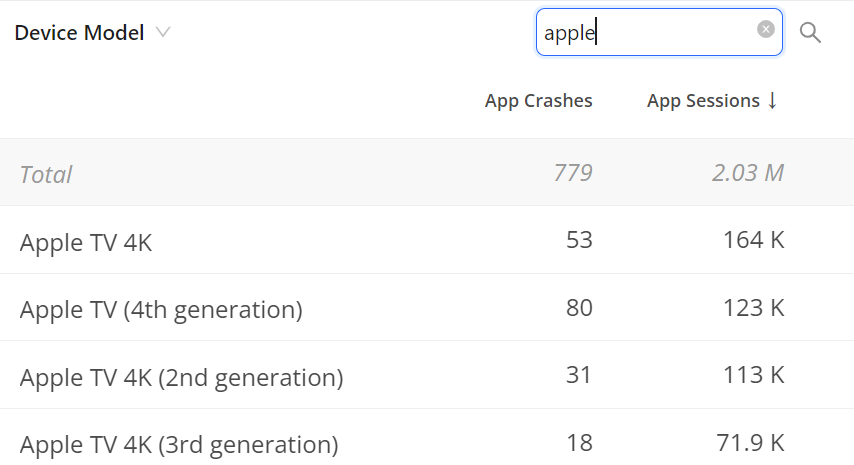
Search the required dimension data using the search box.
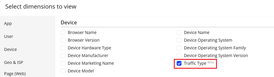
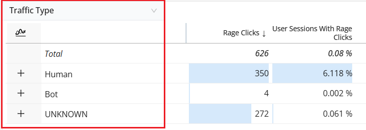
Traffic Type as dimension
With the influx of automated (bot) traffic across web and mobile apps, the Conviva Traffic Type dimension filters out the metric distortion caused by this automated traffic, enabling more precise traffic control and more accurate metric analysis, workflows, and network performance based on actual user experience.
Traffic Type is a dimension that categorizes incoming traffic by origin, behavior, or intended purpose. The system uses Traffic Type to distinguish between human and non-human (bot) traffic, supports semantic data mapping, enables traffic simulation for performance testing, and applies rule-based traffic management. This classification improves analytical accuracy, prevents metric distortion caused by automated traffic, and enables more precise filtering, routing, and traffic evaluation across analytics, testing, and network management workflows.
Note: The Traffic Type dimension is enabled as of 17 December and is supported only for sessions processed on or after this date. Sessions that started before this release and continue after the release are classified as “Unknown,” as Traffic Type information is not available for the portion of the session initiated before the feature enablement.
High Cardinality Dimensions
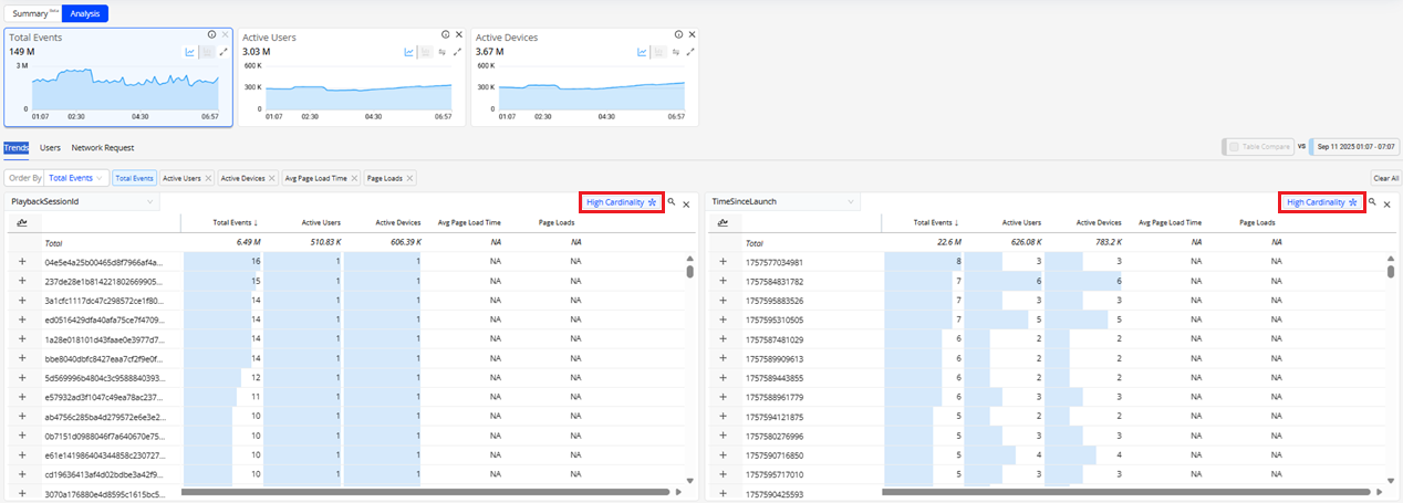
A high cardinality dimension contains millions of unique values. Typical examples include Order ID, Error Code, or Search Query, where most entries are distinct. If more than 80% of the total dimension value is unique, Trends classifies it as a high cardinality dimension.
High cardinality dimensions:
-
Increase storage consumption due to the high volume of distinct entries that must be maintained.
-
Limit dashboard readability, since excessive detail can overwhelm visualizations and hinder actionable insights.
-
Performance degradation due to processing a vast set of unique values.
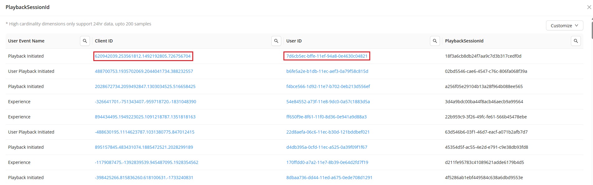
To solve this, DPI stores high cardinality dimensions in a separate event table. To optimize performance and maintain usability, it displays only up to 200 sample values from the last 24 hours.
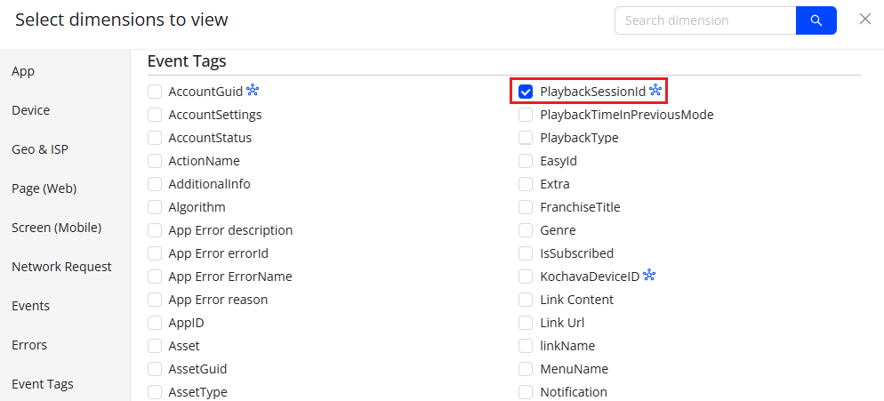
To analyze the high cardinality dimensions,
-
Navigate to Trends and click the Dimension button from the action bar to see the dimension pop-up page.

-
On the dimensions page, select the dimensions with the high cardinality indicator.
The Trends dashboard displays the dimension table with the High Cardinality indicator.
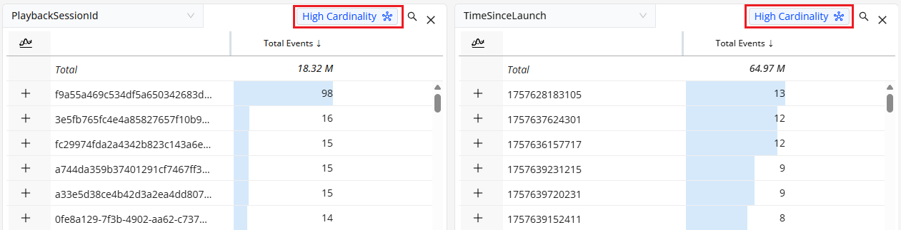
-
On the Trends dashboard, click the High Cardinality button adjacent to the dimension name to see the high cardinality slider screen.
-
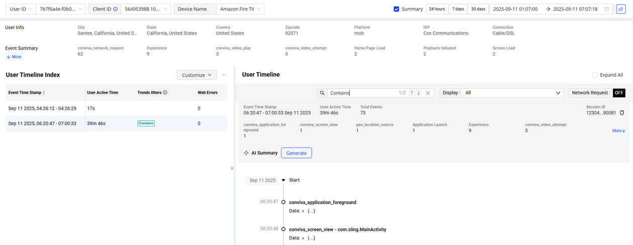
Click Client ID adjacent to the User Event Name to see the User Timeline details for the sample event.
-
On the User Timeline, click Generate adjacent to AI Summary to see the User Timeline summary and analyze the data for anomaly detection.
Urchin Tracking Module (UTM) Parameters
Urchin Tracking Module (UTM) parameters are query strings or tags appended to URLs that help track the effectiveness of marketing campaigns, traffic sources, and content performance within analytics systems (e.g., Google Analytics, Adobe Analytics, or custom tracking platforms). They are short bits of text appended to the end of a URL.
A UTM-tagged URL allows traffic attribution by embedding metadata about the source, medium, campaign, and other contextual elements. These parameters do not alter the page content or functionality, but are essential for understanding how users arrive at the website and which efforts drive the most engagement.
UTM Parameters help marketers and analysts to:
-
Measure which channels (email, social, ads) drive the traffic.
-
Compare ad creatives or placements to see which links perform best.
-
Track ROI of campaigns more accurately and optimize marketing spend.
-
Gain accurate attribution for traffic and conversion.
-
Improve decision-making with granular data in tools like Google Analytics.
The most commonly used UTM parameters include:
-
UTM Source: Identifies the source of the traffic, such as a search engine (e.g., Google), newsletter, or other referral.
-
UTM Medium: Specifies the medium, such as email, cost-per-click (CPC), or social media.
-
UTM Campaign: Identifies the specific marketing initiative and supports precise performance tracking.
-
UTM ID: Links the traffic to a campaign record in the analytics or ad platform.
-
UTM Term: Used for paid search to identify the keywords for the ad.
-
UTM Content: Differentiates similar content or links within the same ad campaign, useful for A/B testing or bucket testing.
UTM Handling
Each 1-minute data bucket inherits the UTM value active during that interval. When a UTM value changes mid-session, subsequent minutes are assigned the new UTM value.
UTM value changes do not impact the session; the UTM changes update the active UTM code for subsequent minutes within the same session.
When grouping data by UTM values in Trends, minutes with no active UTM value are excluded from all UTM groupings. As a result, total UTM minutes may be less than total session minutes.
In Timeline views, the Timeline marks UTM value changes as discrete events alongside other session activity.
10:00:00 Page Load utm_source=google
10:01:15 Button Click
10:03:30 Email Link Click UTM → utm_source=pardot
10:03:31 Page Load
10:05:00 Form Submit
In Flows, Flows are defined by start and end events and are assigned a single UTM value based on the UTM value active at Flow completion.
Dimension Data in Numbers
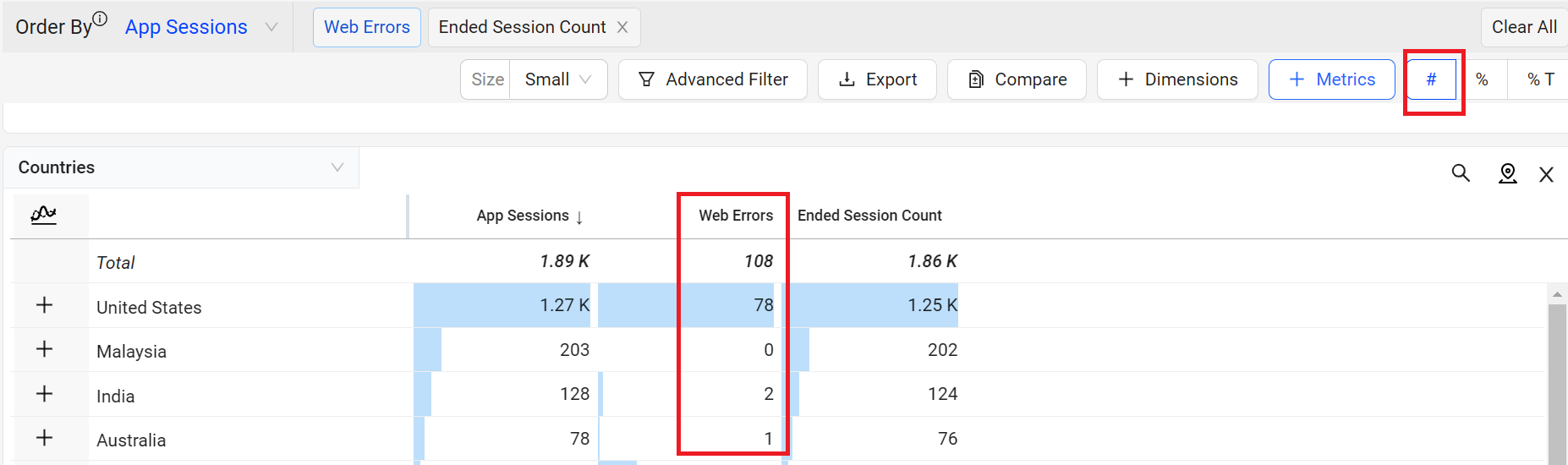
The # toggle option displays the metric value in number format for each dimension value.
Dimension Data in Numbers
Dimension Data in Percentage
The % toggle option displays the metric value in percentage format for each dimension value.
Dimension Data in Percentage
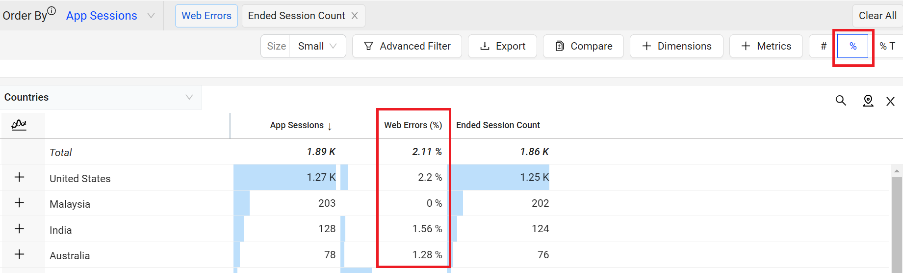
For example, displaying the Web Errors metric as a percentage clarifies which dimension value had the highest percentage of web errors. In this case, it is the United States with 2.2%. The percentage of Web Errors is calculated based on the total web app session count for that dimension value.
Check the table for more details on metrics that can be displayed in percentage format in the dimension table.
Note: Metric data is limited to the data displayed for the dimension values.
| Metric | Percentage of: |
|---|---|
| App Crashes | total native application sessions with application errors. |
| App Video Bounce Rate |
total native application sessions that did not include the video attempt event. |
| Page Load Complete | total native application page loads that loaded completely. |
| Exits Before Page View | total native application page exits that occurred before the full page was drawn on the screen. |
| Web Errors | total web sessions with web processing errors. |
| Network Request Failure |
total networks requests that failed. |
Dimension Data in Percentage of Total
The %T toggle option displays the metric value for each dimension as a percentage of the total dimension metric value within the selected time period.
Dimension Data in Percentage of Total
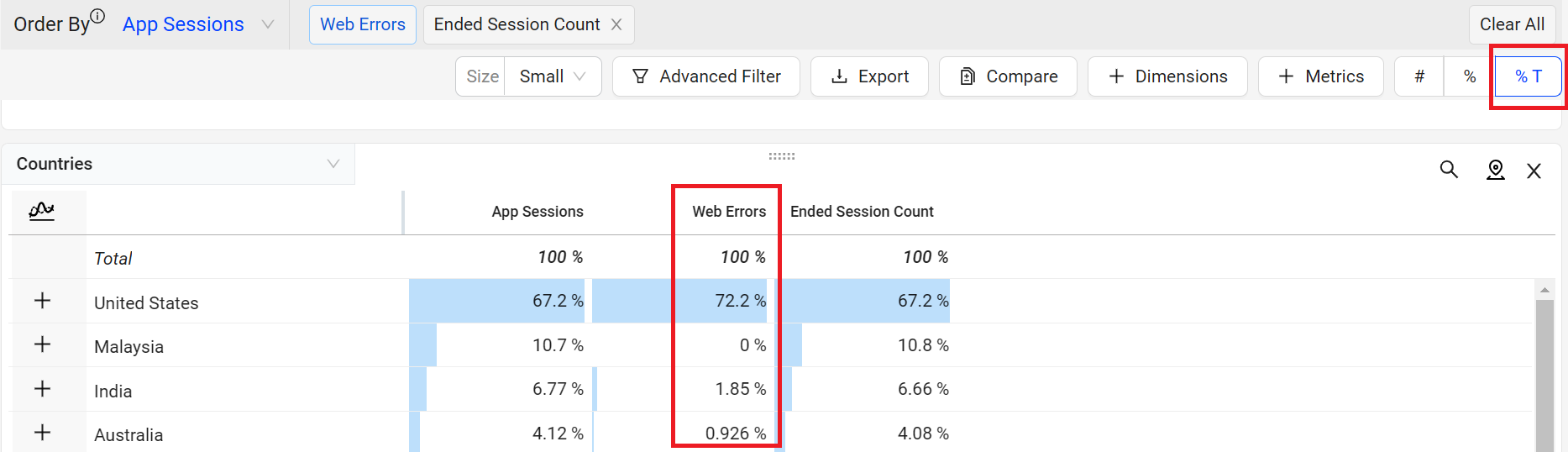
For example, from the web error count the value of the Web Errors for the United States is 78, while the total value of the Web Errors is 108. The Percentage of Total for Web Errors in the United States is 72.2%, calculated by dividing 78 by 108.
The values of these types of metrics can be displayed as a percentage of the total in the dimension table.
-
Count Metrics
-
In dimensions where there is no overlap in different values, the percentage will sum up to 100%. Example: App Crashes and Page Load Complete.
-
In dimensions where the values overlap, such as Active Devices, Users, or Sessions, the percentage total might exceed 100%. In these cases, the unique counts are considered in the total.
-
-
Conversion type (Conversion Counts) custom metrics. For the details of Conversion type and how to create the metric, check Metric Builder.
-
Event aggregation (Number or Total Values) custom metrics. For the details of Event aggregation type and how to create the metric, check Metric Builder.
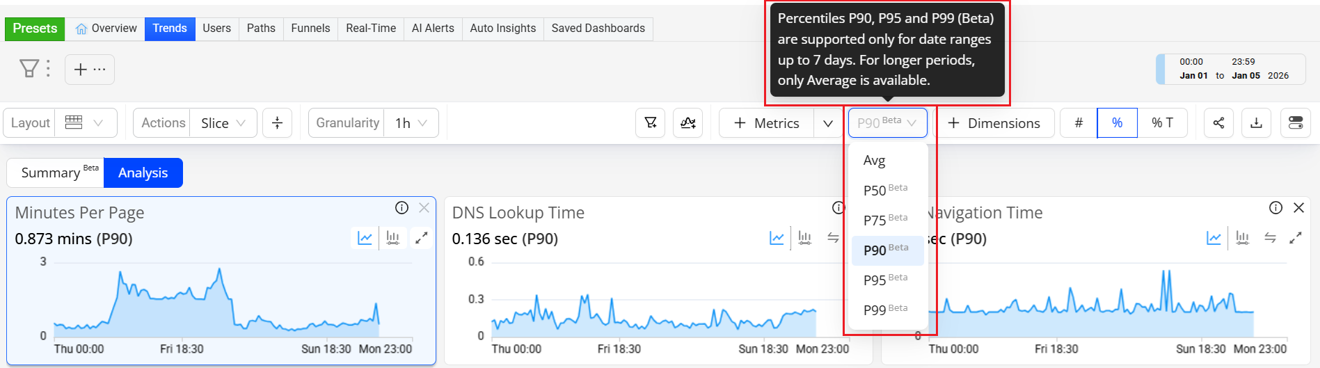
Percentile Aggregation for Duration , Flow-Duration, and Custom Metrics (Beta)
For Duration, Flow-Duration, and Custom Metrics, Conviva introduces percentile data percentile-ranked statistical aggregation for P50, P75, P90, P95, and P99 levels of Flow-Duration and Custom performances. Ranked-flow and custom performance data enable accurate measurement of performance distributions, minimizing the impact of long-tail outliers that can distort average-based metrics. Percentile aggregation provides a statistically robust representation of data and aligns Conviva analytics with industry-standard performance measurement practices.
By sorting and then ranking data, a percentile indicates the value below which a given percentage of observations fall. For example, within a ranked data set of session performance,
-
P50 (50th percentile) means 50% of the session performance is completed at or below this value.
-
P95 (95th percentile) means 95% of session performance is completed at or below this value, and only the slowest 5% take longer.
Note: Percentiles indicate the distribution of experience, not just a single average value. In some cases, a single average value might be misleading because a few extreme values can distort the result. Percentiles show what different levels of users actually experienced, more clearly indicating a small group of user experiences.
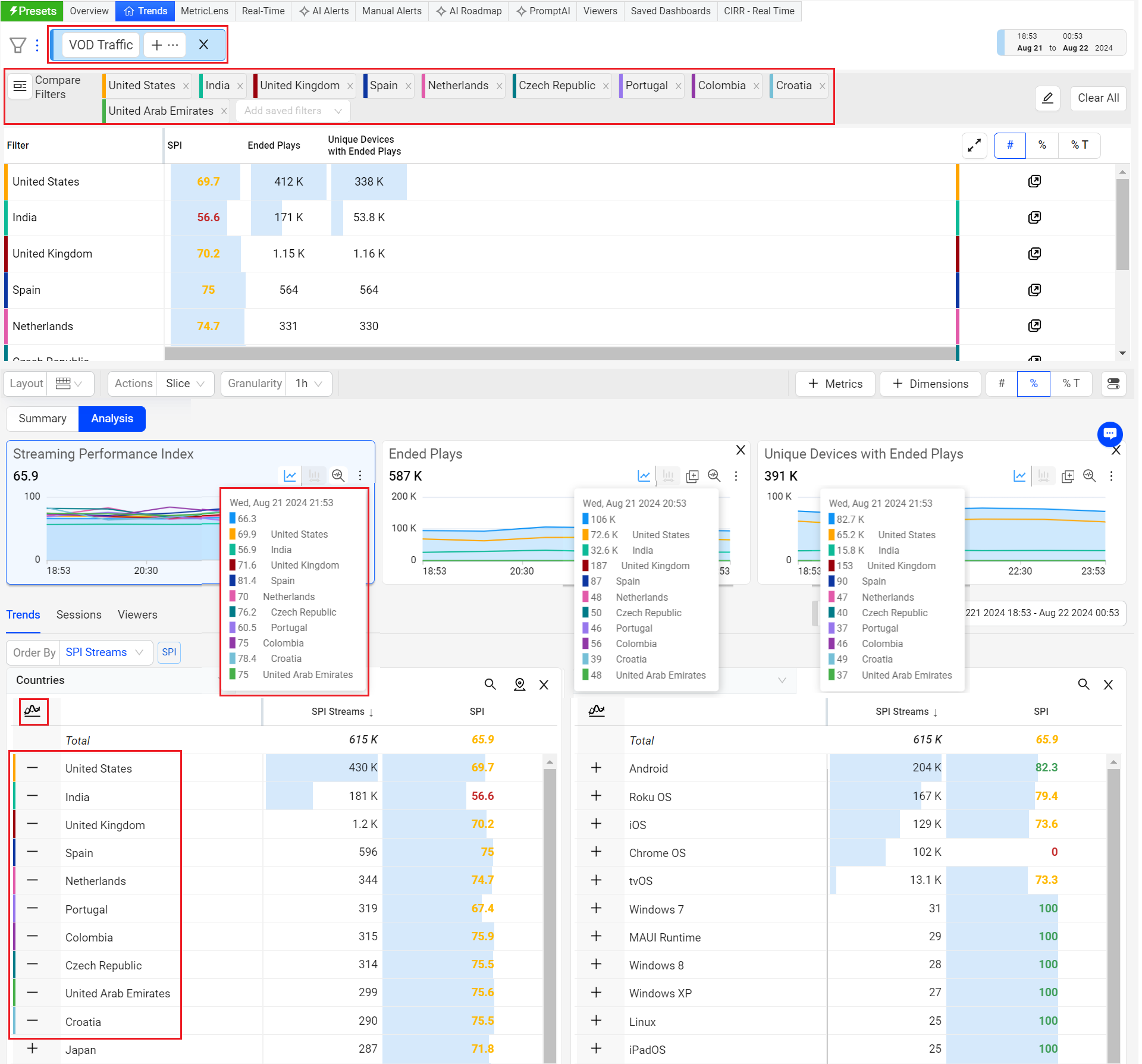
Adding data from the same dimension table creates a logical OR while adding data from different dimension tables creates a logical AND during filter creation.
The compare filters can support up to 20 filters. Clicking the Compare Top filters button generates filters for up to the top ten dimensions listed in Trends. Individually add the remaining filters or include any other ten dimensions by clicking the Compare Top filters button in the corresponding dimension table.
Discovering Impacted Users
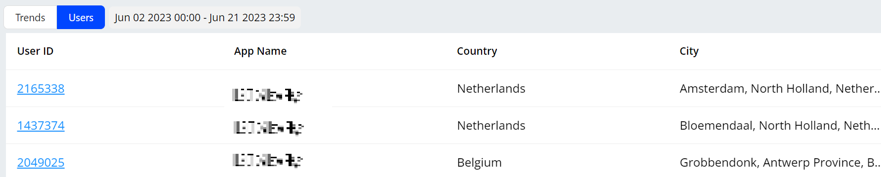
The Users tab provides events and data, such as user ID, app name, country, and city, related to user activities. Click a user ID to go to the user timeline for comprehensive and granular analysis of a session.
Troubleshoot Network Request and RCA Mode
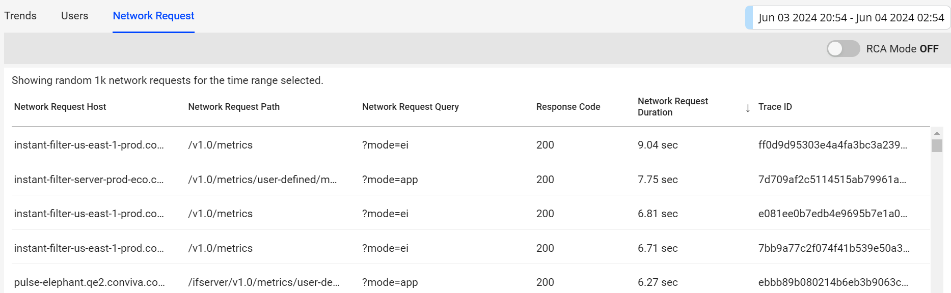
The Network Request tab provides a table showing data related to network requests, such as the network request host and trace ID, to help analyze network request performance.
The screenshot shows all 200 codes with the highest duration at the top. Even with success response codes, long network request durations may indicate under-performing requests.
Network Request Tab
RCA Mode (To be deprecated on March 26, 2026)
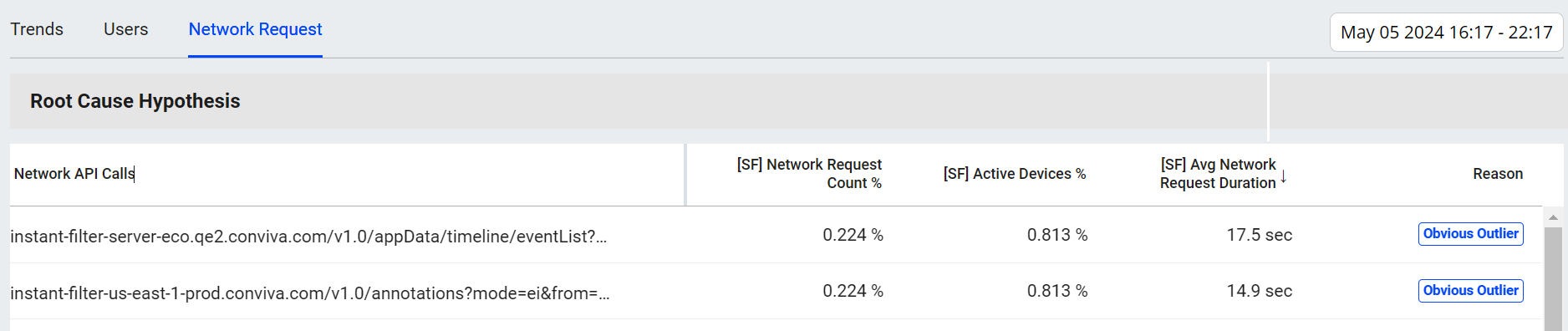
In the Trends Network Request tab, RCA mode enables easy detection and quick analysis of network response root causes. The Root Cause Hypothesis table displays the network API calls with the longest durations among the sessions. This mode also displays other analysis data related to the API calls such as network request count and active devices percentages.
The RCA mode is enabled only when using one of the supported metrics as a secondary filter (slicing the metric distribution) including Avg App Startup Time, Avg Network Request Duration, Avg Screen Load Time, and Avg Page Load Time. Hover over Supported Metrics to view the complete list of these metrics.
RCA Mode
Connect Stack Trace and Error Messages
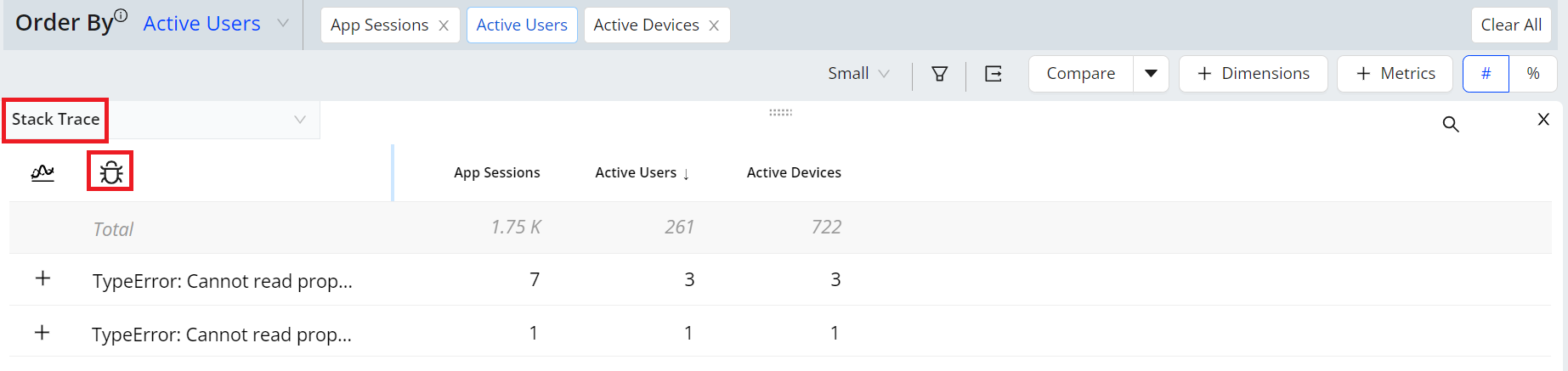
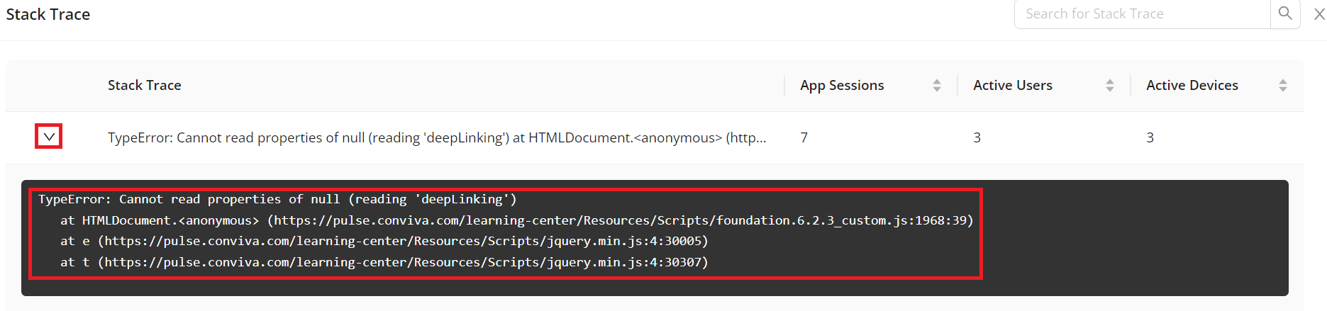
The Stack Trace and Error Messages tables provide complete messages that enhance the dimension table data with additional performance details.
-
Click the View errors icon of the dimension table.
-
Click the toggle arrow icon on the left side of an error message in the Error Message pop-up window, and check the detailed messages.
Analyze Presets
Web Experience
Quickly analyze the Web Experience using key metrics, including Page Load Time, Page Loads, Minutes Per Page, Web Errors, Active Devices, App Sessions (Interval), and App Active Time (Interval). Evaluate page and web attributes to investigate trends and identify issues across critical user experience areas, providing a consistent data analysis across teams to support reliable performance monitoring and decision-making.
Web Experience Preset
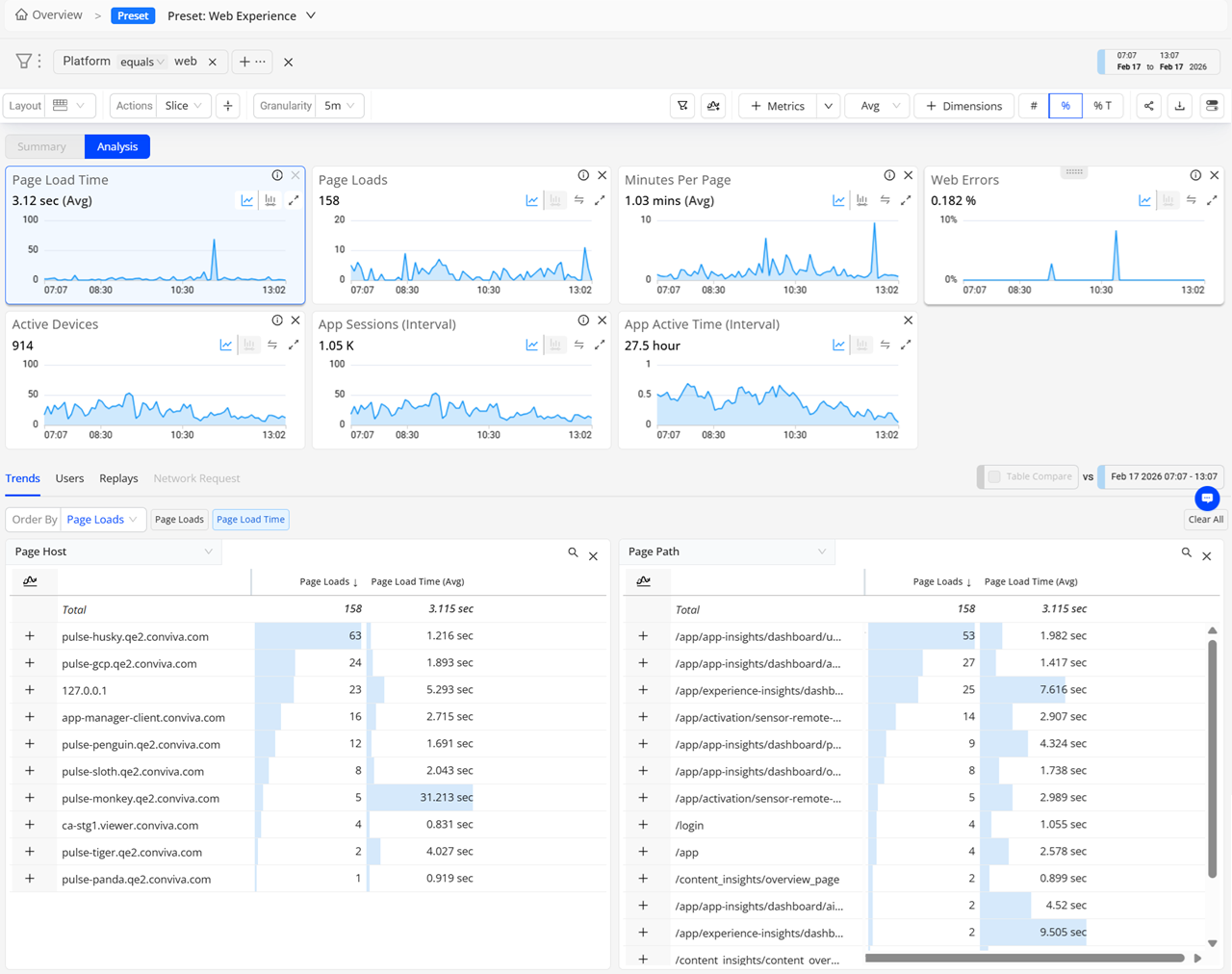
To access the Web Preset,
-
From the Trends dashboard:
-
In the Dimension Table, hover over any dimension value, and then click the Drill down to Events view icon to navigate to the respective view with the dimension value as the primary filter for further analysis.
-
In the Dimension Table, click the icon near the dimension heading to be directed to the respective view with the primary filter set to All Traffic for further analysis.
OR
-
On the Metrics pop-up window, click the Preset icon next to the metric category to see the associated preset dashboard.
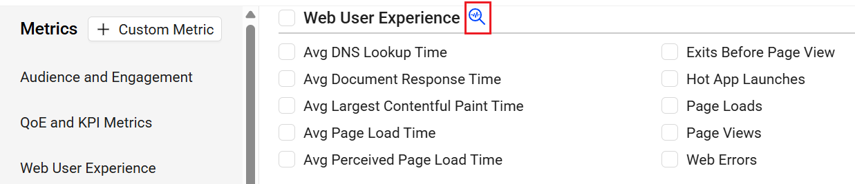
-
Secondary Filters for Multi-Layered Diagnostics
Secondary filters overlay another filter layer on the main filter derived data. This type of filtering can be especially useful for analyzing performance issues across multiple nested dimension areas, such as high Avg Mins Per Page across 4.x app versions to correlate the app versions with high mins per page.

Activate a secondary filter by dragging portions of the metric distribution in the metric widgets. For example, select areas in the Avg Mins Per Page data buckets from 3m -5m to >=10min to apply a secondary filter for app sessions with minutes per page. This filtering overlays the main filter, which can be set to a specfic set of app versions.
Secondary filtering enables analysis based on specific metric performance, such as only app sessions with average minutes per page greater than 30 seconds.
The distribution selection also displays the related metric in the dimension tables for easy impact analysis. In this case, Avg Minutes Per Page is highlighted and enables a quick determination of top page URL use.
Mobile Experience
Quickly analyse the Mobile Experience using key metrics, including Screen Load Time, ScreenLoads, App Startup Time, App Startup Count, App Crashed, ANR Count, Active Devices, App Sessions (Interval), App Active Time (Interval). Evaluate the screen, ANR, and device attributes to investigate trends and identify issues across critical user experience areas. This analysis provides a consistent data analysis across teams to support reliable performance monitoring and decision-making.
Mobile Experience Preset
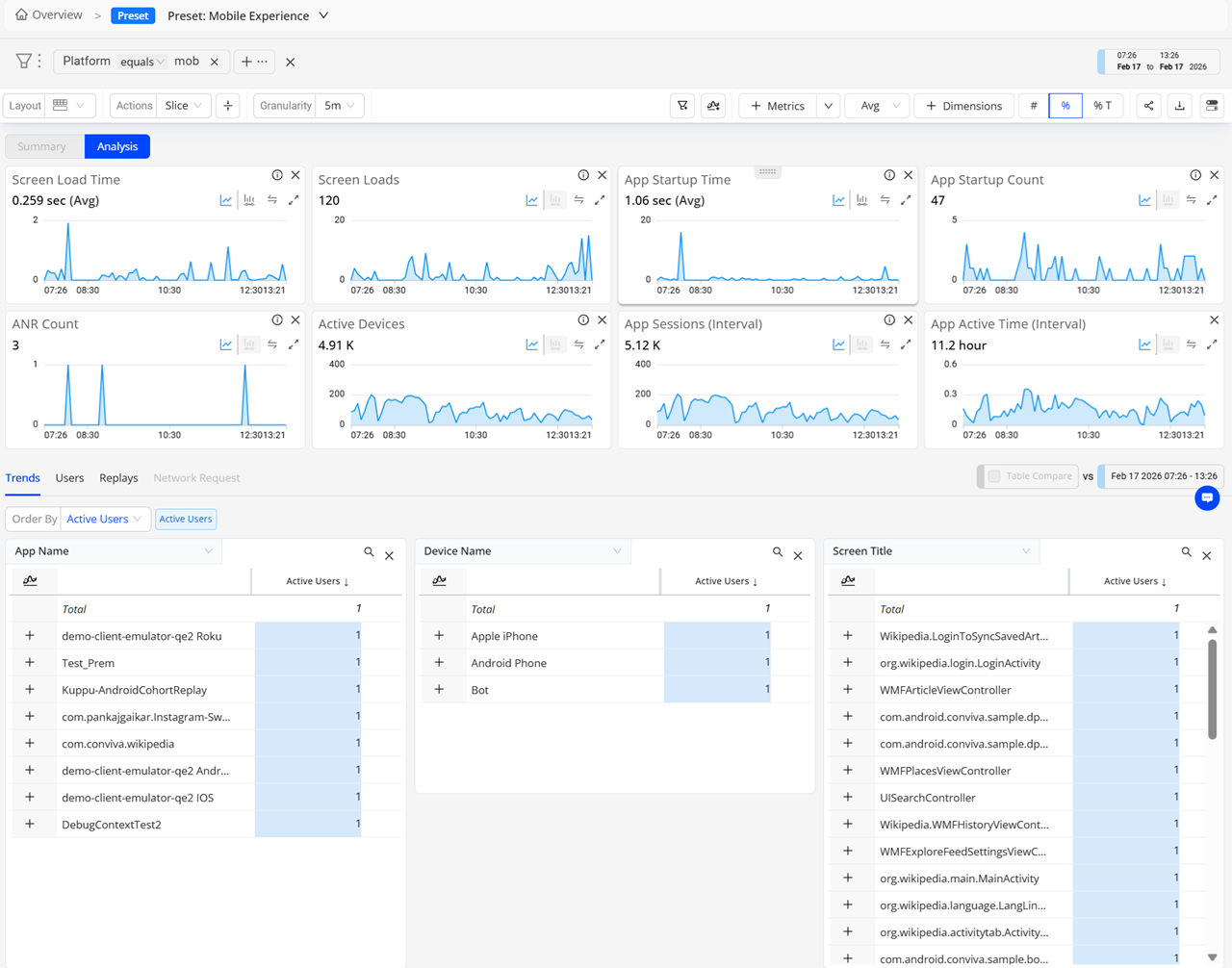
To access the Mobile Preset,
-
From the Trends dashboard:
-
In the Dimension Table, hover over any dimension value, and then click the Drill down to Events view icon to navigate to the respective view with the dimension value as the primary filter for further analysis.
-
In the Dimension Table, click the icon near the dimension heading to be directed to the respective view with the primary filter set to All Traffic for further analysis.
OR
-
On the Metrics pop-up window, click the Preset icon next to the metric category to see the associated preset dashboard.

-
Service Performance
Easily examine network requests and response durations to monitor server-side performance based on the related metrics and dimensions, including Network Request Count, Avg Network Request Duration, Network Request Failure, and Active Users.
Analyze the correlation between Network Request Count, Avg Network Request Duration, and Active Users, to discover the root causes of long average network request durations, and follow up with the app optimizations to enhance user experiences.
Service Performance Preset
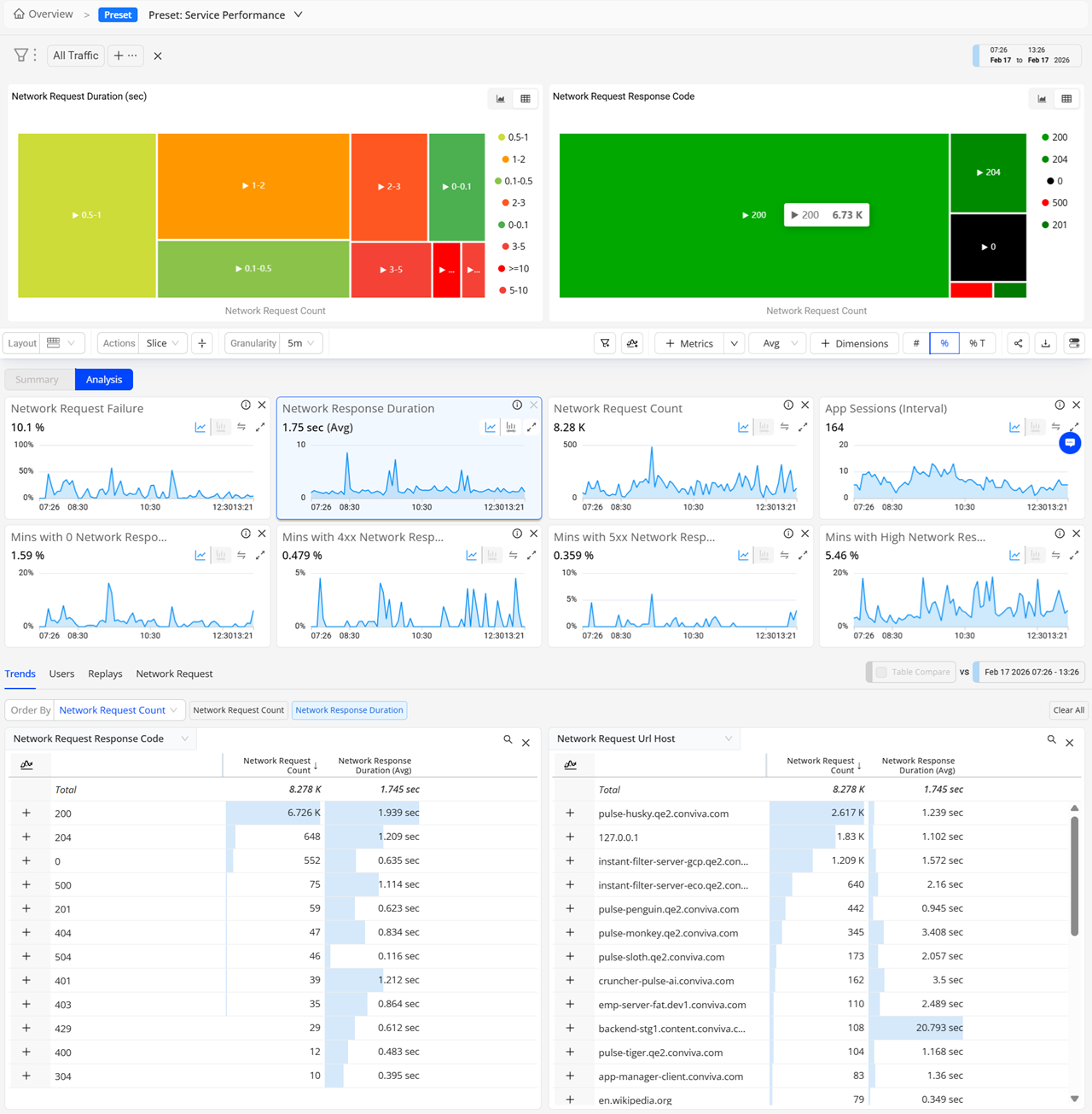
To access the Service Preformance Preset,
-
From the Trends dashboard:
-
In the Dimension Table, hover over any dimension value, and then click the Drill down to Events view icon to navigate to the respective view with the dimension value as the primary filter for further analysis.
-
In the Dimension Table, click the icon near the dimension heading to be directed to the respective view with the primary filter set to All Traffic for further analysis.
OR
-
On the Metrics pop-up window, click the Preset icon next to the metric category to see the associated preset dashboard.

-
Events
Efficiently monitor and analyze the occurrence of system and user-generated event within your app. View the Global and Event tags from the Event preset.
For example, observe the correlation between Total Events, User Event, and Active Users, to identify which features or actions are driving user engagement for feature enhancement and targeted user experiences.
Events Preset